#1db954
Copy
Copied


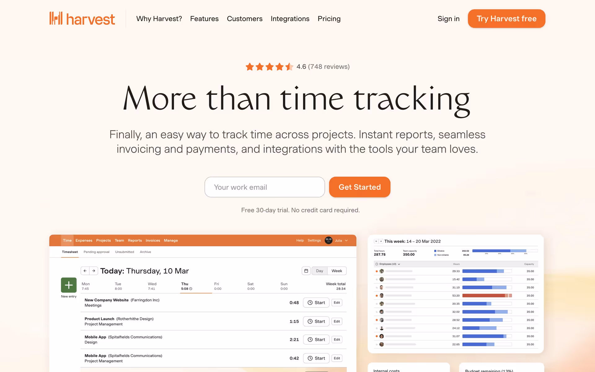
Harvest is a time tracking and invoicing software designed to streamline project management and financial tasks. Harvest's branding and interface designs prominently feature colors like Heavy Metal (#1D1E1C), Bridal Heath (#FFF8F1), and Blaze Orange (#FA5D00). You can easily copy Harvest's colors in Hex, CMYK, RGB, and other popular formats on this page.
The main colors in Harvest's color palette are Heavy Metal (#1D1E1C), Bridal Heath (#FFF8F1), and Blaze Orange (#FA5D00). These colors create a balanced and visually appealing design that can inspire your next project.
The primary color in Harvest's app, Heavy Metal (#1D1E1C), conveys a sense of reliability and professionalism, aligning with the brand's identity as a robust and dependable time-tracking tool. Complementing this, Bridal Heath (#FFF8F1) adds a touch of warmth and approachability, while Blaze Orange (#FA5D00) injects energy and urgency, enhancing the overall message of efficiency and productivity.
Harvest's color scheme, prominently featuring orange hues, reflects its mission to help teams spend time wisely and improve efficiency. The choice of bright, energetic colors aligns with the brand's focus on clarity, productivity, and support for professional services.
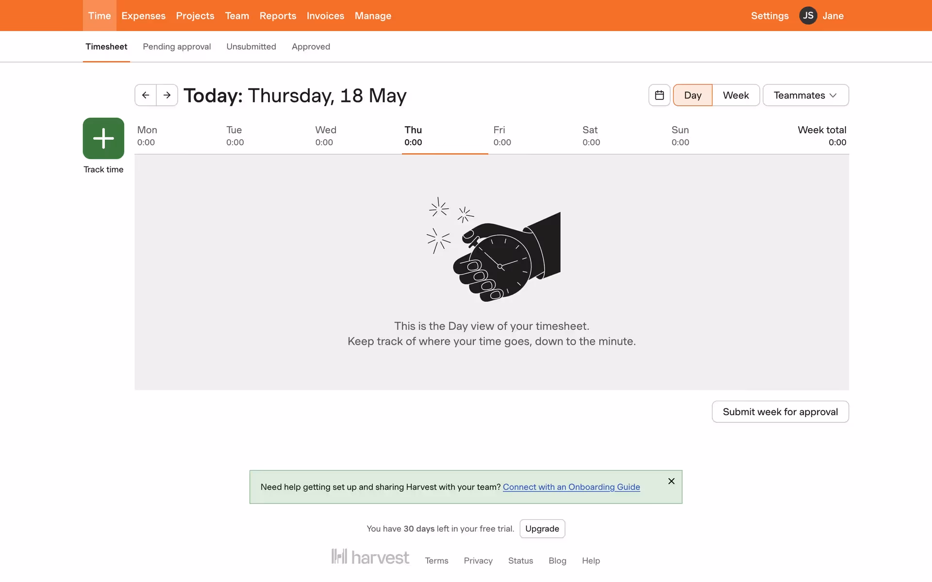
Harvest uses color psychology to create a seamless and intuitive user experience. The dark, almost black-gray "Heavy Metal" provides clarity and legibility for navigation and text, while the light "Bridal Heath" background creates a clean, open feel. The bright "Blaze Orange" is strategically used for call-to-action buttons, drawing your eye and encouraging interaction. These color choices guide your actions, influence decisions, and enhance the overall user experience.
To complement Harvest's primary color (#1D1E1C), consider using shades like deep teal (#005F73) for a balanced look, or mustard yellow (#FFC300) to create a striking contrast. These colors can enhance your design by adding depth and vibrancy while maintaining a cohesive aesthetic.
On Mobbin’s brand colors page, you can explore a curated list of brand color palettes from top companies. We also offer access to thousands of other UI designs and interfaces from various brands, making it a great resource for finding new color combinations and getting inspiration from real-world examples.
Mobbin offers an extensive, constantly updated collection of mobile and web design patterns, showcasing the latest trends in UI/UX design, from color usage to user flows. By using Mobbin, you can easily explore current design practices and stay ahead of trends in the industry.
Ready to elevate your design game? Try Mobbin today for free as long as you like, or get full access with any of our paid plans.


Use Mobbin for free as long as you like or get full access with any of our paid plans.


