#1db954
Copy
Copied

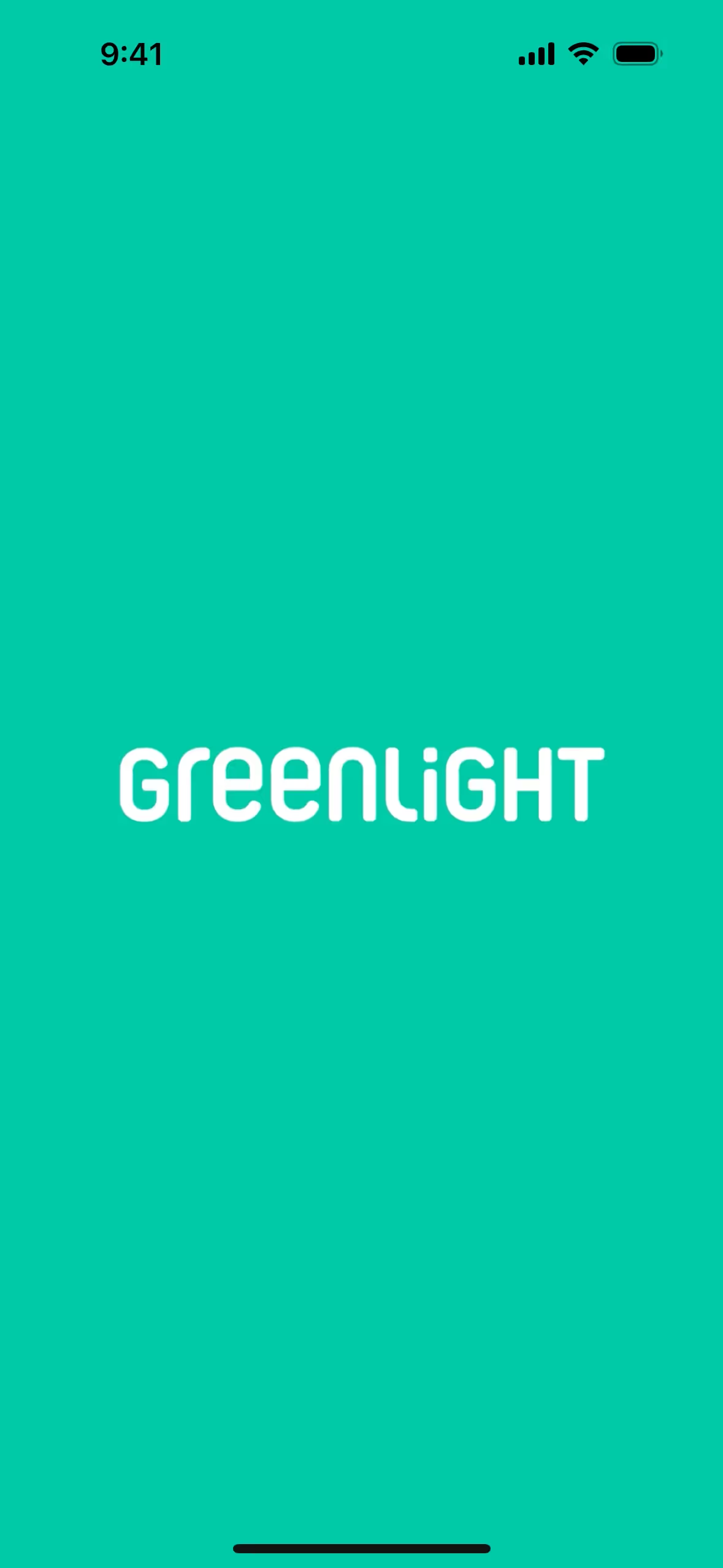
Greenlight Financial Technology, Inc. offers the Greenlight app, a debit card for kids. Its branding and interface designs feature Saffron, White, Ebony Clay, and Puerto Rico. We've made it easy for you to copy these colors in Hex, CMYK, RGB, and other formats.
To help you find inspiration for your next project, we've identified Greenlight's primary color palette. It's built around four key colors: Saffron (#F4BA42), Puerto Rico (#3BBFAD), Ebony Clay (#1D252C), and White (#FFFFFF).
Greenlight's signature saffron yellow radiates optimism and financial empowerment, making money feel approachable and positive for you. We notice how the supporting dark gray and teal ground the experience with a sense of trust and clarity, reinforcing the brand's core message.
While Greenlight hasn't publicly detailed the history of their color choices, the palette powerfully reflects its core mission. We see their use of green as a direct nod to financial growth and safety, creating an intuitive visual language for families.
We see Greenlight masterfully use its core teal to guide your main financial actions, with saffron accents highlighting progress and rewards. The high-contrast ebony and white palette ensures a clear and focused experience, making money management feel both trustworthy and empowering.
To create a striking contrast with the signature saffron, we'd explore deep royal blues for a confident, energetic feel, or rich, earthy tones like terracotta to ground the palette with a touch of modern sophistication.
On our brand colors page, you can explore a curated list of color palettes from top companies. You'll also find thousands of other UI designs and interfaces, making it the perfect place to discover new color combinations and draw inspiration from real-world examples.
Mobbin helps you stay ahead with our extensive, constantly updated collection of mobile and web design patterns. By exploring the latest trends in UI/UX, from color usage to complete user flows, you can easily keep a pulse on current design practices and lead the way in the industry.
You can try Mobbin today for free for as long as you like, or get full access with any of our paid plans.


Use Mobbin for free as long as you like or get full access with any of our paid plans.


