#1db954
Copy
Copied


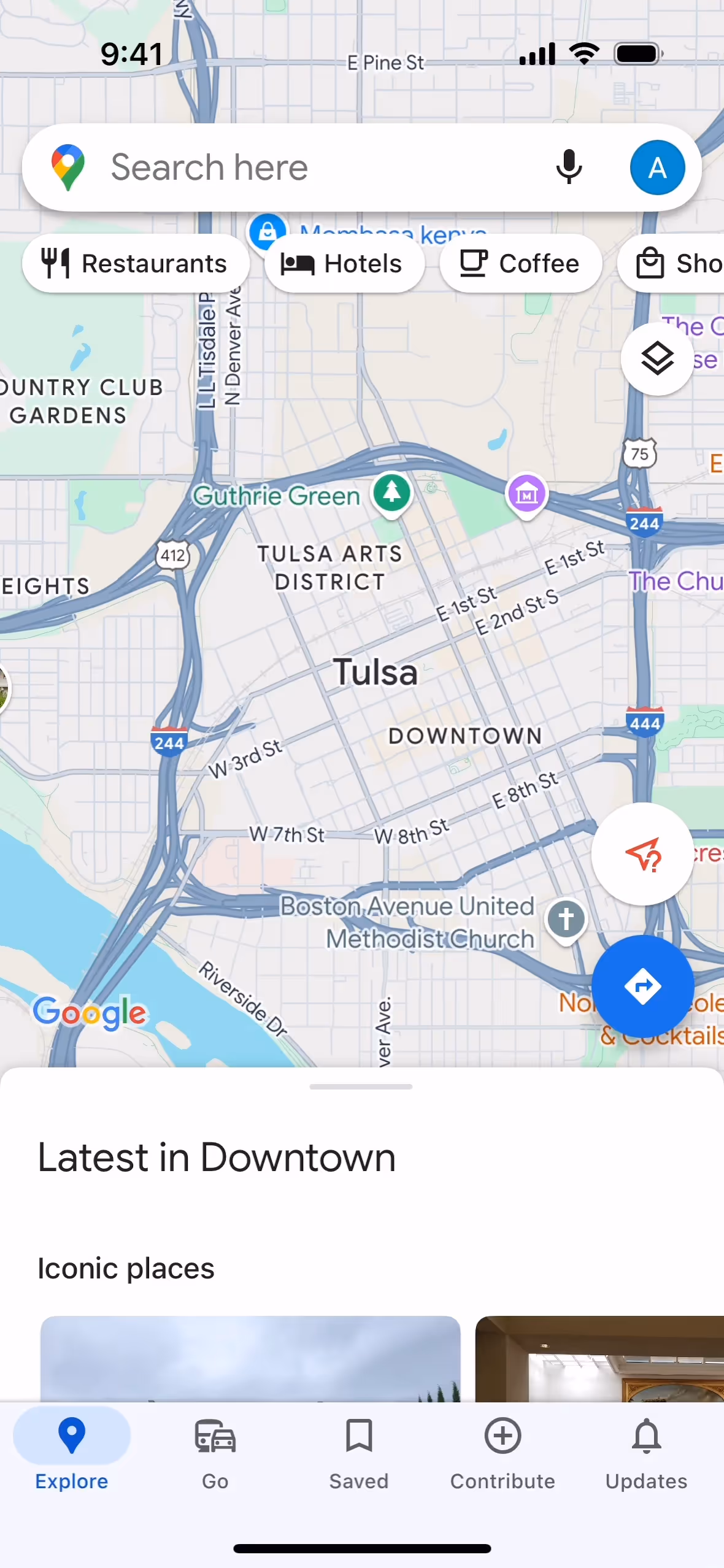
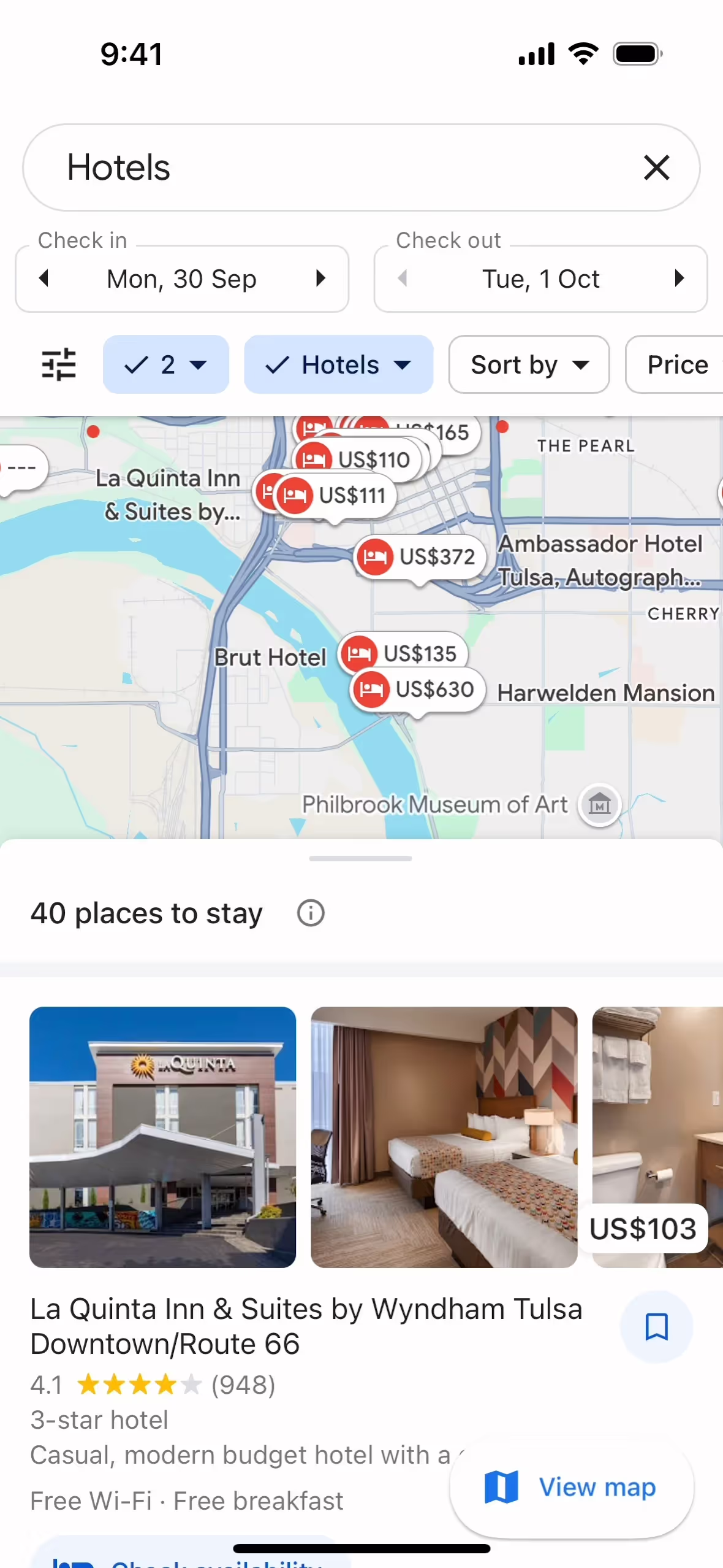
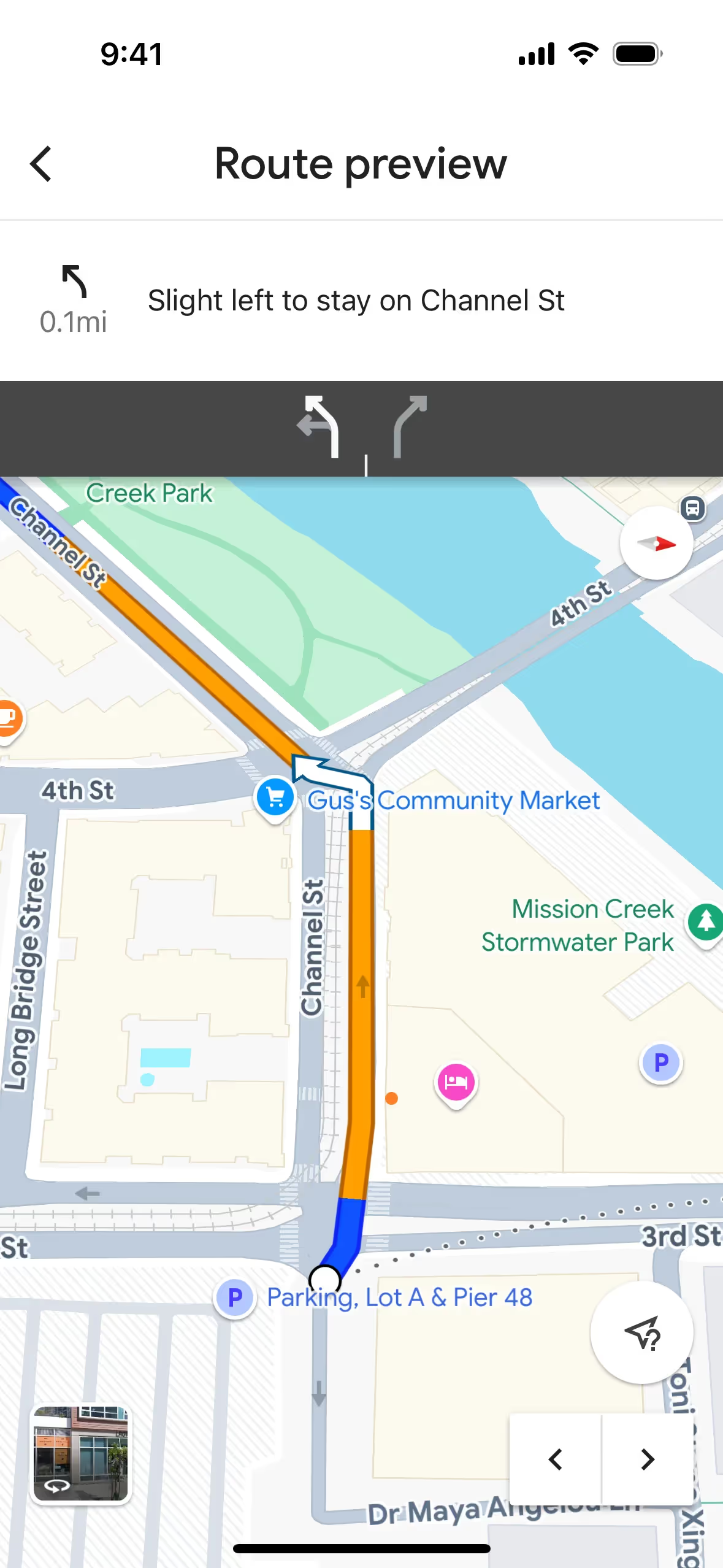
Google Maps is a web-based mapping service offering interactive maps, satellite imagery, and real-time traffic conditions. The platform's branding and interface designs feature a clean, modern color palette, including Red (#EA4335), Light Blue (#4285F4), Yellow (#FBBC04), Blue (#1A73E8), and Green (#34A853). You can easily copy these colors in Hex, CMYK, RGB, and other popular formats from this page.
The main colors in Google Maps's color palette are Red (#EA4335), Light Blue (#4285F4), Yellow (#FBBC04), Blue (#1A73E8), and Green (#34A853). These vibrant hues are designed to enhance usability and visual appeal, providing a cohesive and intuitive user experience.
The primary color in Google Maps, #EA4335, is a vibrant red that conveys energy, urgency, and importance, aligning with the brand's identity of providing essential navigation and location services. This red, along with other prominent colors like light blue (#4285F4), yellow (#FBBC04), blue (#1A73E8), and green (#34A853), creates a dynamic and approachable interface that enhances your experience by making navigation intuitive and visually engaging.
Google Maps's color scheme has evolved to enhance usability and clarity, influenced by the need for intuitive navigation and user-friendly design. The choice of colors aims to distinguish various map elements effectively, ensuring that you can easily identify roads, landmarks, and other key features.
Google Maps uses color psychology to create an intuitive and emotionally neutral interface. For instance, red (#EA4335) is used for location pins to draw immediate attention, while blue (#1A73E8) for navigation routes instills a sense of trust and reliability. Green (#34A853) highlights parks and natural features, promoting relaxation and exploration, and yellow (#FBBC04) is used for traffic conditions, making important information stand out without causing alarm.
To complement Google Maps's primary color (#EA4335), consider using shades like teal (#008080) for a balanced look, or navy blue (#000080) for a striking contrast. These colors can enhance the visual appeal and create a cohesive design palette.
On Mobbin’s brand colors page, you can explore a curated list of brand color palettes from top companies. We also offer access to thousands of other UI designs and interfaces from various brands, making it a great resource for finding new color combinations and getting inspiration from real-world examples.
Mobbin helps you stay up-to-date with the latest UI/UX trends by offering an extensive, constantly updated collection of mobile and web design patterns. From color usage to user flows, our platform showcases the latest trends in UI/UX design, allowing you to easily explore current design practices and stay ahead in the industry.
Ready to elevate your design game? Try Mobbin today for free as long as you like, or get full access with any of our paid plans.
Use Mobbin for free as long as you like or get full access with any of our paid plans.


