#1db954
Copy
Copied


Google is a leading search engine and technology company. Its branding and interface designs prominently feature the colors blue (#4285F4), green (#34A853), yellow (#FBBC05), and red (#EA4335). You can easily copy Google's colors in Hex, CMYK, RGB, and other popular formats in this page.
The main colors in Google's color palette are blue (#4285F4), green (#34A853), yellow (#FBBC05), and red (#EA4335). These vibrant hues are designed to create a visually engaging and recognizable brand identity.
Google's primary color, #4285F4, conveys a sense of trust, reliability, and innovation, aligning perfectly with the brand's identity as a leader in technology and information. Complementing this, the green (#34A853) symbolizes growth and harmony, the yellow (#FBBC05) evokes optimism and energy, and the red (#EA4335) represents passion and excitement. Together, these colors create a vibrant and dynamic palette that enhances Google's overall message of accessibility and forward-thinking.
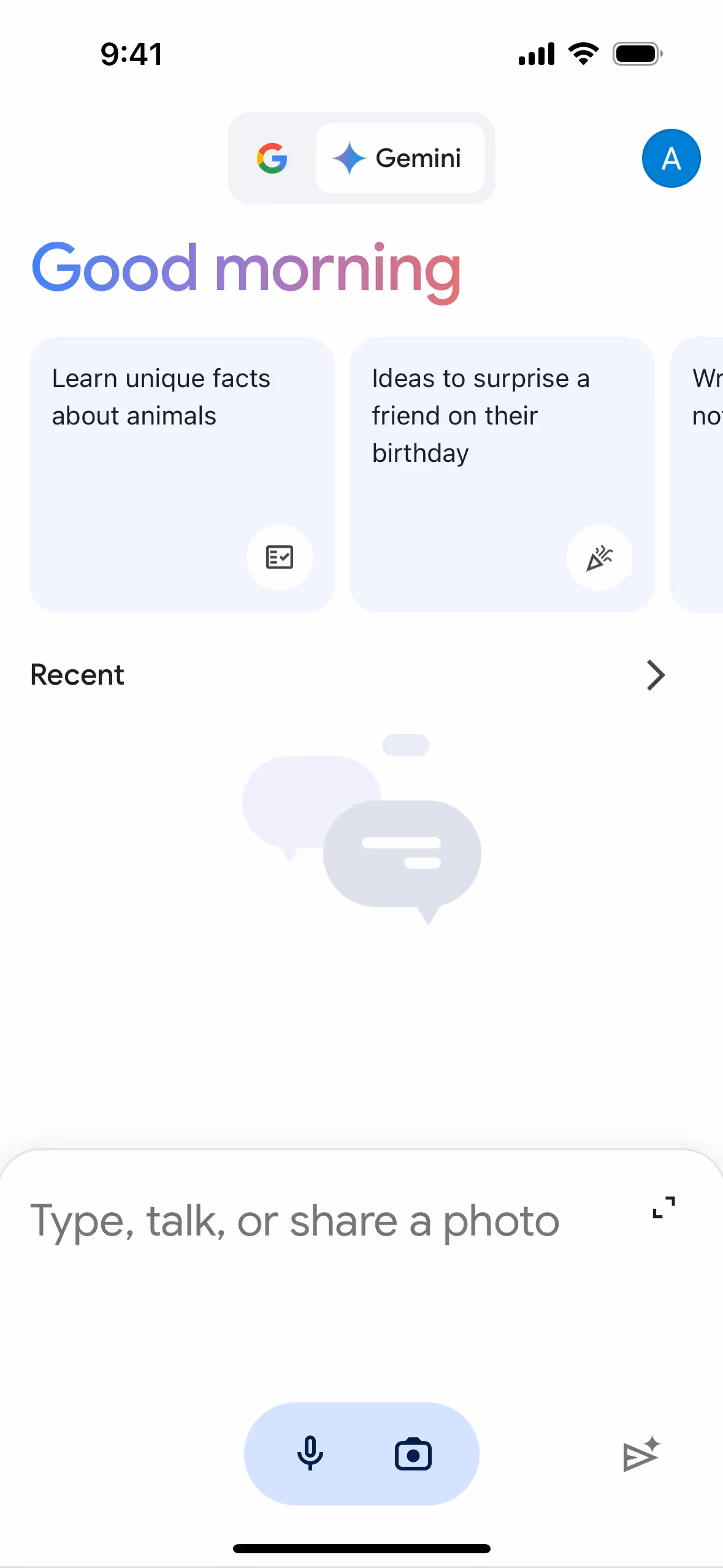
Google's color scheme, characterized by its playful and vibrant multicolored logo, has been a core part of its identity since its inception. The choice of colors was influenced by the need for visual clarity, playfulness, and distinctiveness, ensuring that the brand remains recognizable and engaging across all platforms.
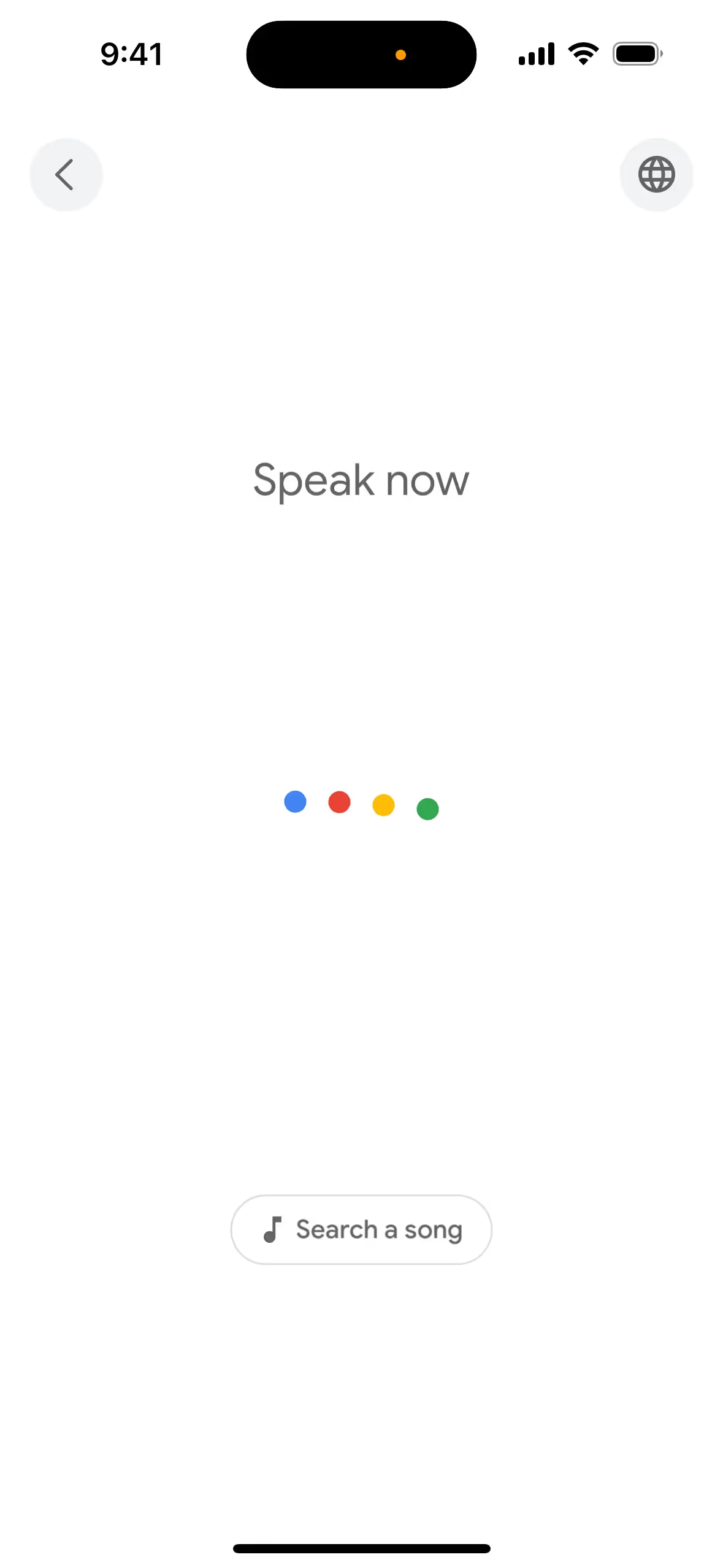
Google's color choices—blue, green, yellow, and red—are strategically used to guide your actions, influence decisions, and create specific user experiences. These vibrant colors are designed to be friendly and approachable, ensuring that you can easily recognize and interact with Google's products across various devices and contexts. The dynamic use of these colors in elements like the Google Dots helps communicate system states and responses, making your interactions with Google both intuitive and delightful.
To complement Google's primary blue (#4285F4), consider using colors like coral (#FF6F61) for a vibrant contrast, or soft lavender (#E6E6FA) for a balanced, calming effect. These choices can enhance your design by adding depth and visual interest.
On Mobbin’s brand colors page, you can explore a curated list of brand color palettes from top companies. We also offer access to thousands of other UI designs and interfaces from various brands, making it a great resource for finding new color combinations and getting inspiration from real-world examples.
Mobbin helps you stay up-to-date with the latest UI/UX trends by offering an extensive, constantly updated collection of mobile and web design patterns. From color usage to user flows, you can easily explore current design practices and stay ahead of trends in the industry.
Don't miss out—try Mobbin today for free as long as you like, or get full access with any of our paid plans.


Use Mobbin for free as long as you like or get full access with any of our paid plans.


