#1db954
Copy
Copied

GoodRx, Inc. is a platform for comparing prescription drug prices and getting discounts. Its branding and interface designs feature a palette of Mine Shaft, Cararra, Cerulean Blue, and Kournikova. You can easily copy these colors in Hex, CMYK, RGB, and other popular formats on this page.
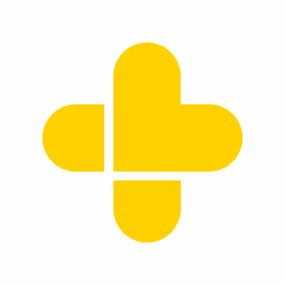
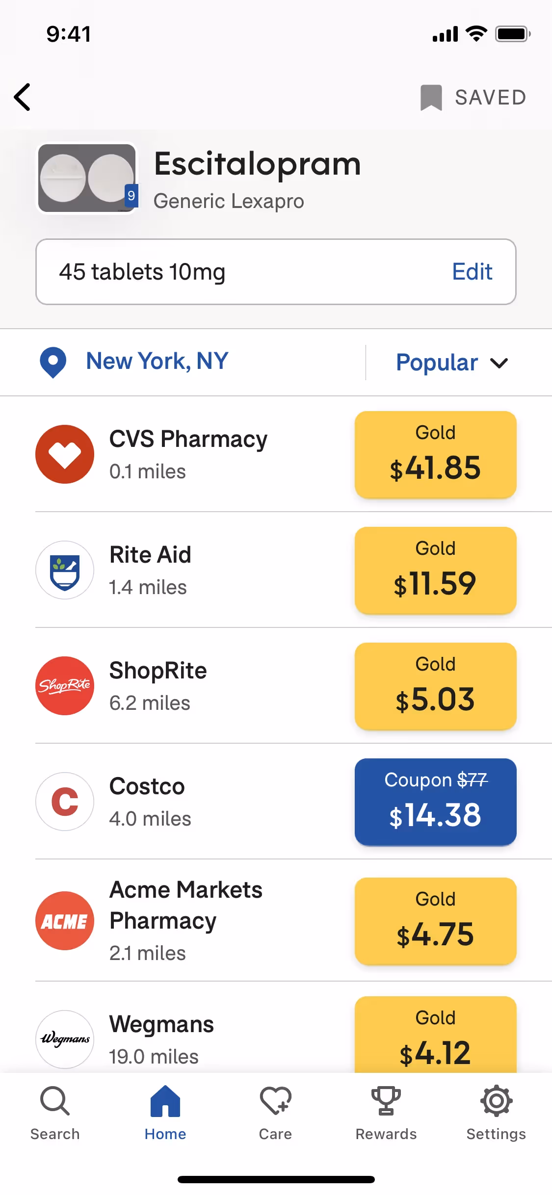
We've found that GoodRx's main color palette gives you a versatile foundation with four key shades: a deep Mine Shaft (#222222), a clean Cararra (#F7F7F4), their signature Cerulean Blue (#3268B9), and a vibrant Kournikova yellow (#FFE574).
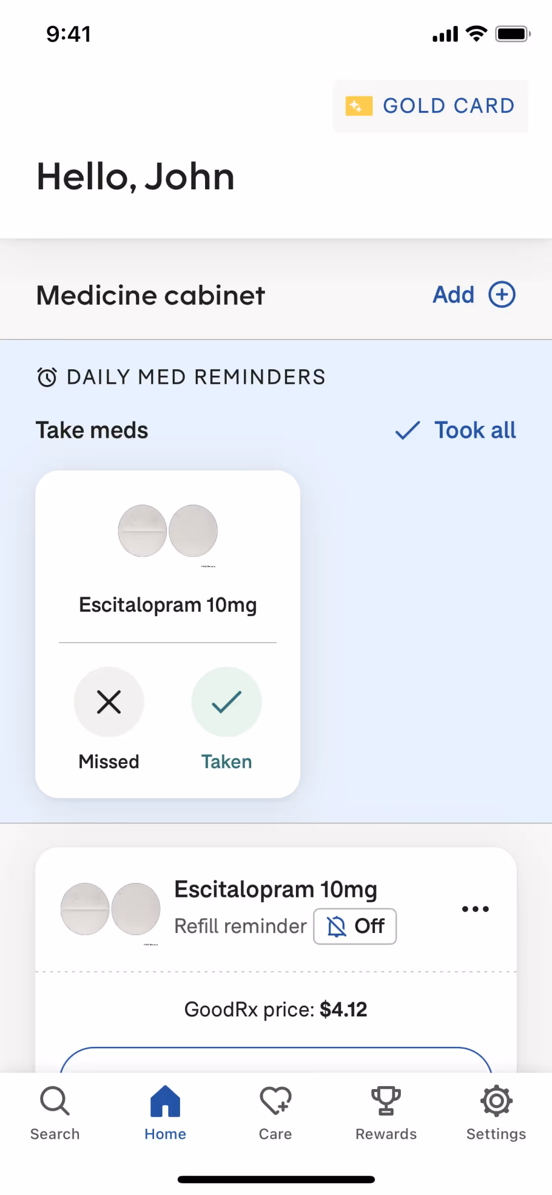
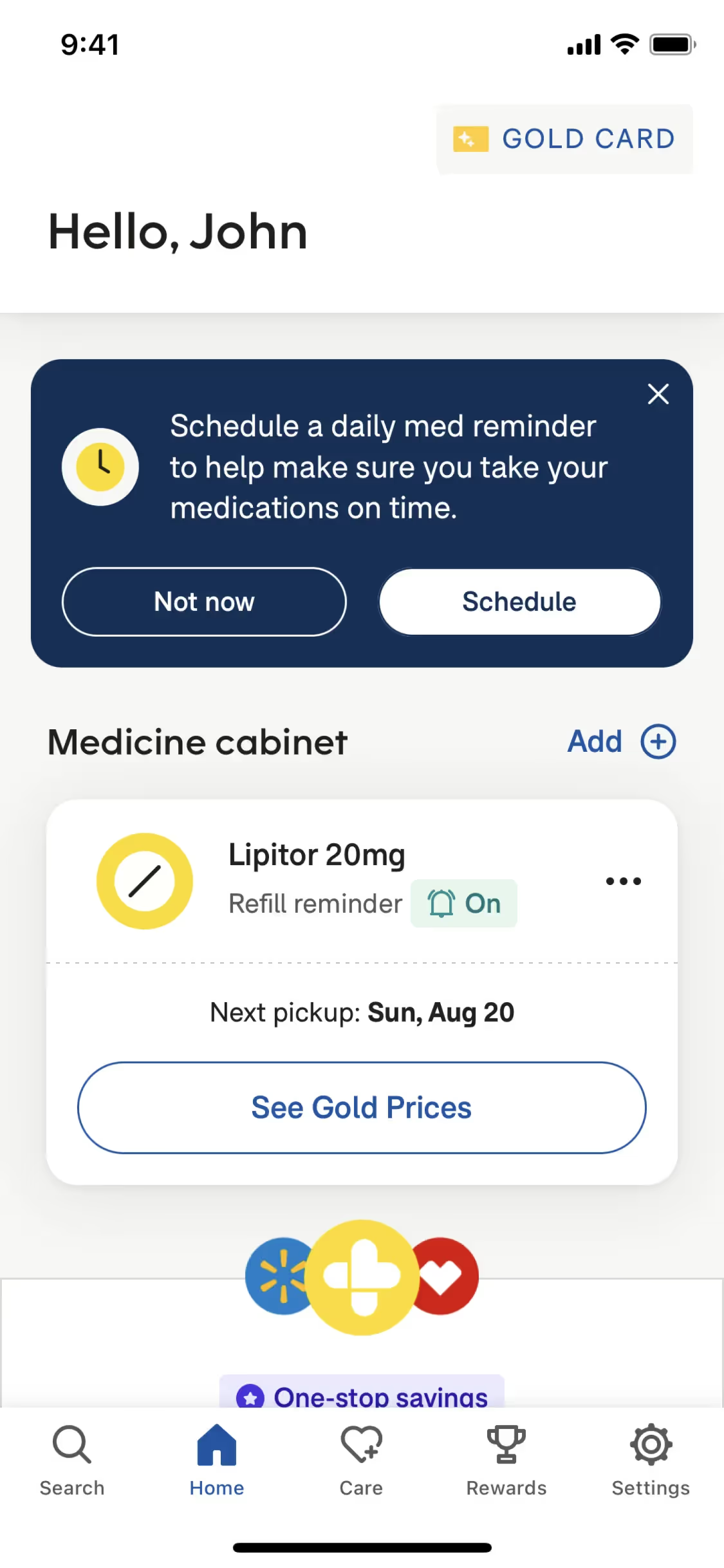
GoodRx's deep gray foundation conveys trust and authority, while accents of dependable blue and hopeful yellow create a palette that feels both professional and reassuringly accessible. This color system works to build your confidence as you navigate healthcare savings.
While the specific origin story of GoodRx's brand colors isn't publicly detailed, their strategic use is clear. The palette is expertly crafted to build a sense of trust and guide you toward affordability and care.
We've observed how GoodRx strategically pairs the trustworthy Cerulean Blue with an optimistic Kournikova yellow, a combination that builds your confidence while guiding you toward savings. This powerful duo is grounded by the high-contrast pairing of Mine Shaft and Cararra, which creates an exceptionally clear and focused user journey.
To create a striking contrast against their primary black, we suggest a vibrant, trustworthy green for key interactions. Alternatively, you could introduce an earthy terracotta to build a sense of warmth and reliability throughout the user experience.
On our brand colors page, you can explore curated color palettes from top companies. We also offer access to thousands of UI designs from various brands, providing endless inspiration for your next color combination.
Our platform offers an extensive, constantly updated library of mobile and web design patterns, allowing you to see the latest UI/UX trends in action—from evolving color palettes to innovative user flows. By exploring our curated collection, you can easily keep a pulse on current design practices and stay ahead of the curve in the industry.
You can try Mobbin today for free for as long as you like, or get full access with any of our paid plans.
Use Mobbin for free as long as you like or get full access with any of our paid plans.


