#1db954
Copy
Copied

1661, Inc. operates GOAT, a leading marketplace app for authentic sneakers and apparel. Their branding and interface designs primarily feature the minimalist colors of Mine Shaft and White. You can easily copy these colors in Hex, CMYK, RGB, and other formats on this page.
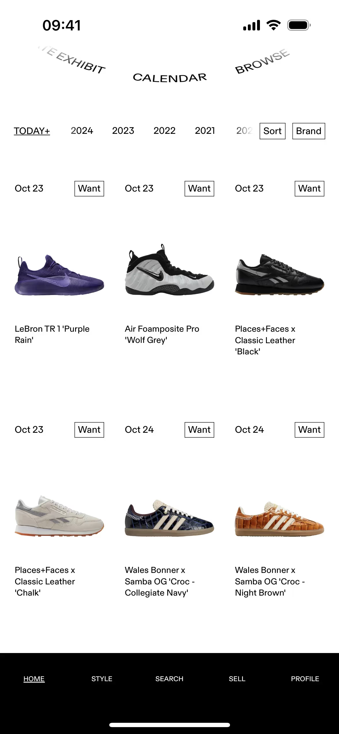
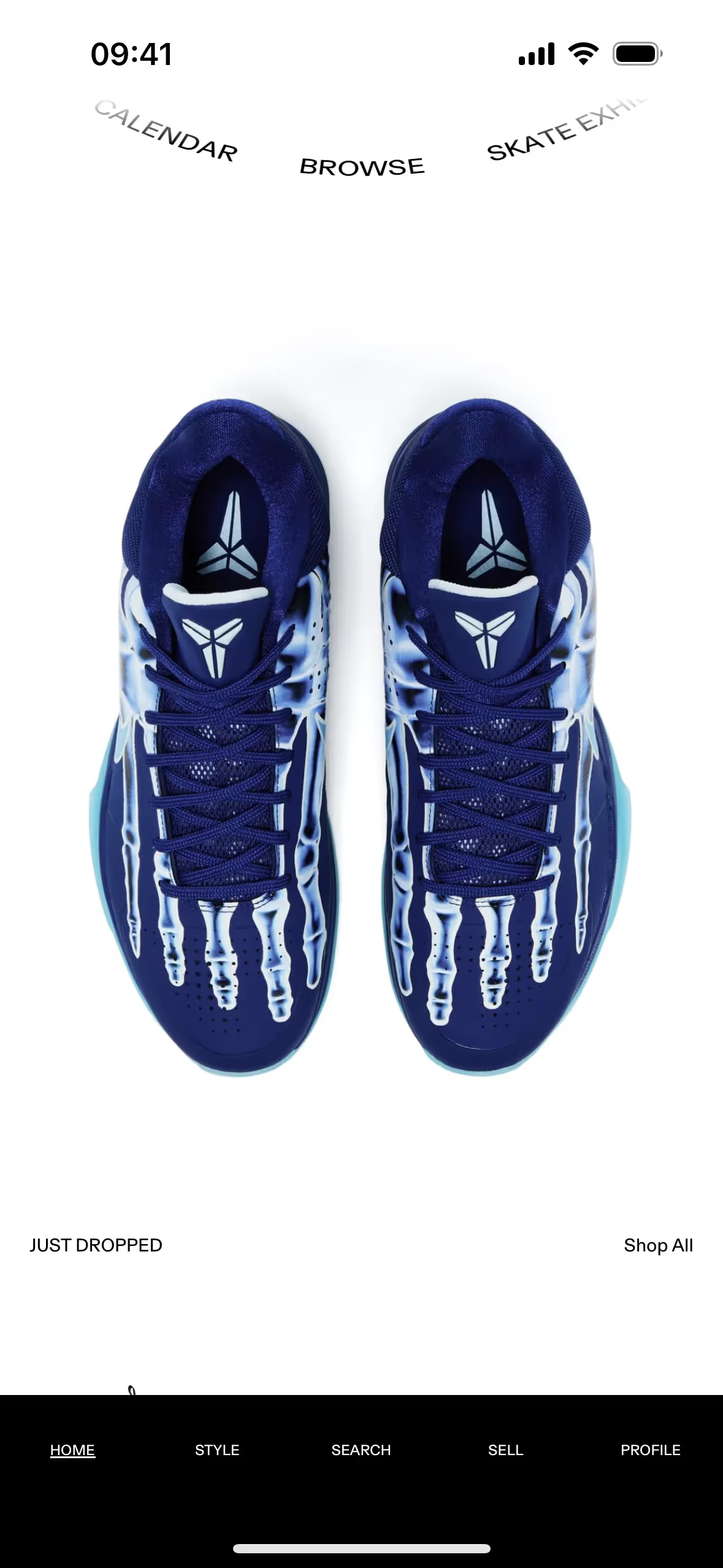
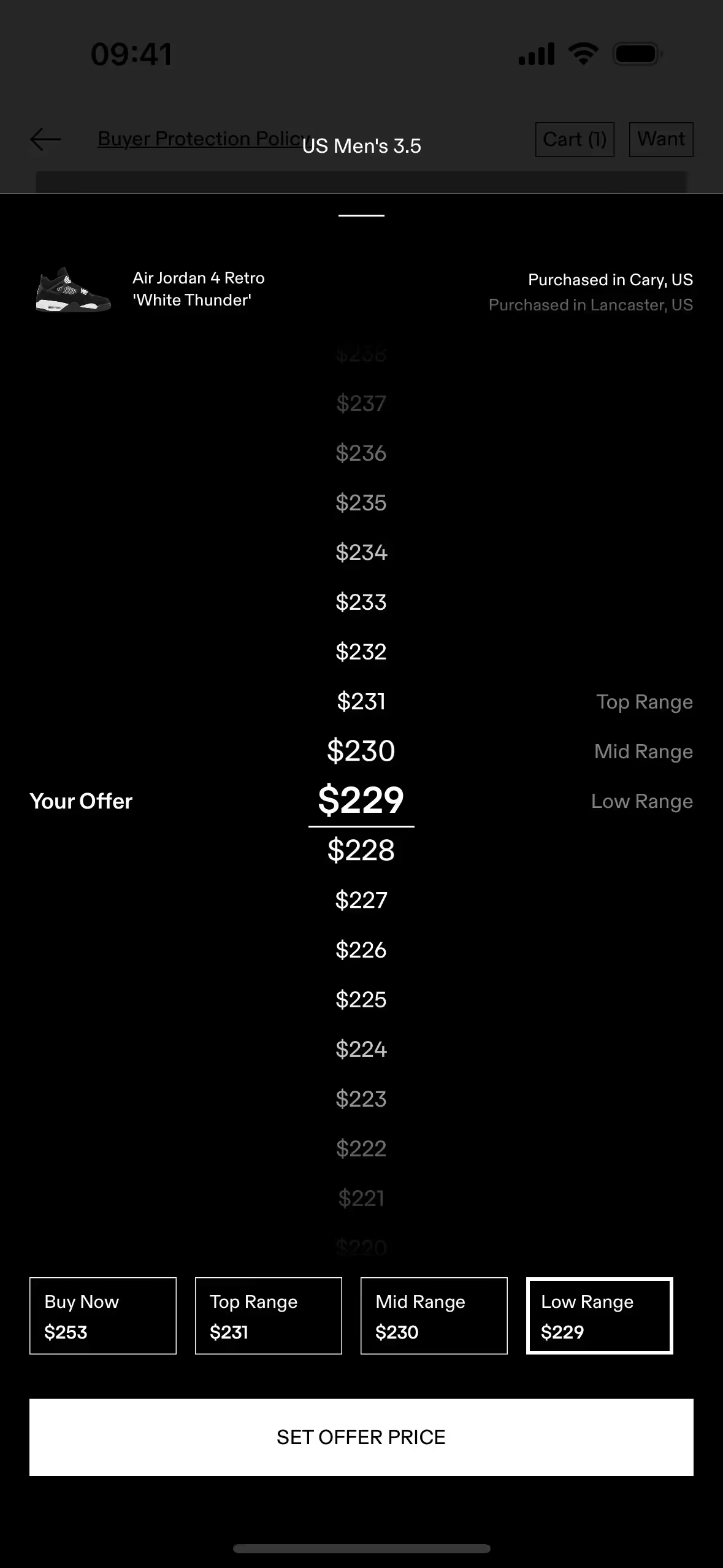
In GOAT's app, you'll notice a clean and focused color palette. They primarily use two core colors: a dark, versatile grey known as Mine Shaft (#313131) and a crisp White (#FFFFFF).
GOAT's primary charcoal color establishes a sense of luxury and authority, allowing the vibrant sneakers to command your attention. The stark white accents create a clean, high-contrast environment that reinforces the platform's premium and trustworthy identity.
GOAT's minimalist black-and-white palette is a strategic choice that puts the focus squarely on their products, allowing the vibrant sneaker colorways to truly pop. We see this as a powerful example of how a neutral branding scheme can elevate the items you're showcasing.
GOAT's high-contrast, black-and-white palette is a masterclass in focus, creating a premium experience that lets the products shine. This minimalist approach guides your eye directly to the photography and key actions, ensuring the interface supports, rather than competes with, the items you're browsing.
To build on GOAT's classic monochrome palette, we suggest introducing a vibrant accent like electric blue for key actions or earthy tones such as olive green for a more grounded, premium feel. These additions can help you create visual hierarchy and guide user attention without overpowering the core brand identity.
On our brand colors page, you can explore curated color palettes from top companies. We also offer access to thousands of UI designs from various brands, providing endless inspiration for your next color combination.
Mobbin's extensive library is your window into the latest UI/UX trends, with our collection of mobile and web design patterns updated weekly. By exploring everything from innovative color palettes to complex user flows from top apps, you can easily keep your finger on the pulse of the industry and ensure your designs are always current.
Why wait to get inspired? Try Mobbin today for free, or unlock full access with one of our paid plans.

Use Mobbin for free as long as you like or get full access with any of our paid plans.


