#1db954
Copy
Copied


Gmail is a secure, smart, and easy-to-use email service. Its branding and interface designs prominently feature colors like Blue (#4285F4), Dark Red (#C5221F), Red (#EA4335), Yellow (#FBBC04), and Green (#34A853). You can easily copy Gmail's colors in Hex, CMYK, RGB, and other popular formats on this page.
The main colors in Gmail's color palette are Blue (#4285F4), Dark Red (#C5221F), Red (#EA4335), Yellow (#FBBC04), and Green (#34A853). These colors are carefully chosen to create a vibrant and cohesive user experience.
The primary color in Gmail's app and website, #4285F4, conveys a sense of trust, reliability, and professionalism, aligning with Gmail's brand identity as a dependable email service. Other prominent colors, such as #EA4335 (Red), #FBBC04 (Yellow), and #34A853 (Green), enhance this message by adding vibrancy and energy, making the interface both engaging and user-friendly.
Gmail's color scheme, featuring the iconic red, blue, yellow, and green, aligns with Google's broader brand identity, emphasizing simplicity, accessibility, and a cohesive user experience across its suite of products. This choice reflects Google's commitment to creating a visually unified and easily recognizable interface for users.
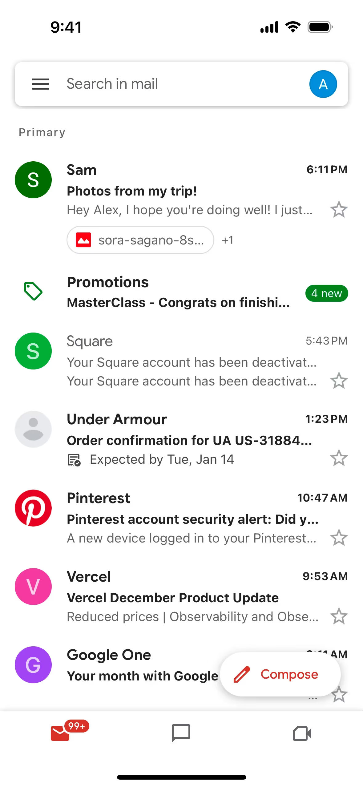
Gmail uses color psychology to create a user-friendly and efficient interface. Blue is used for primary actions like "Compose" and "Send," instilling trust and reliability. Red highlights errors and spam, drawing immediate attention, while yellow signals caution for non-critical issues. Green reassures users with success messages, and a neutral background maintains focus and reduces cognitive load.
To complement Gmail's primary color (#4285F4), consider using shades like coral (#FF6F61) for a vibrant contrast, or soft lavender (#E6E6FA) for a calming balance. These colors can enhance your design by adding depth and visual interest.
On Mobbin’s brand colors page, you can explore a curated list of brand color palettes from top companies. We also offer access to thousands of other UI designs and interfaces from various brands, making it a great resource for finding new color combinations and getting inspiration from real-world examples.
Mobbin offers an extensive, constantly updated collection of mobile and web design patterns, showcasing the latest trends in UI/UX design, from color usage to user flows. By using Mobbin, you can easily explore current design practices and stay ahead of trends in the industry.
Don't miss out—try Mobbin today for free as long as you like, or get full access with any of our paid plans.
Use Mobbin for free as long as you like or get full access with any of our paid plans.


