#1db954
Copy
Copied


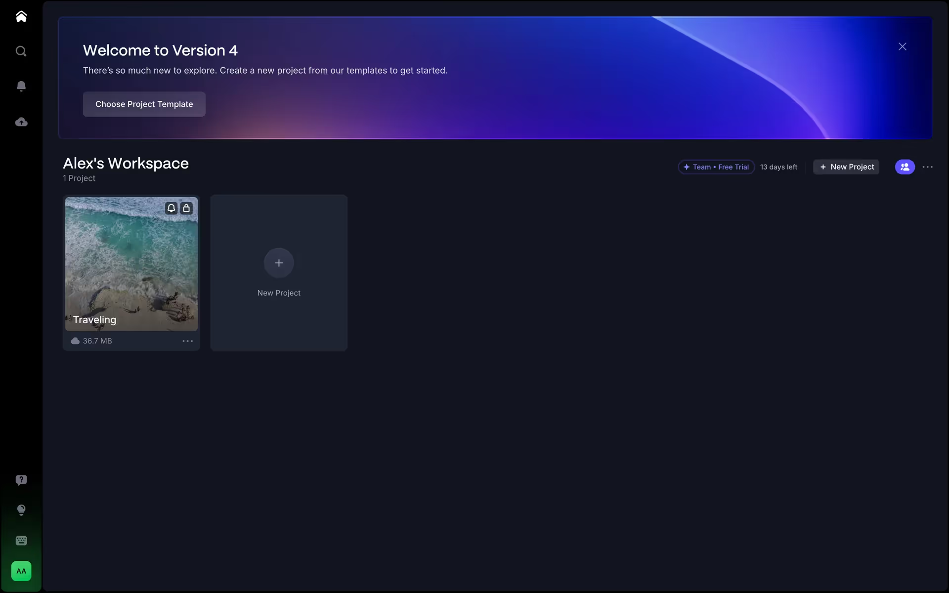
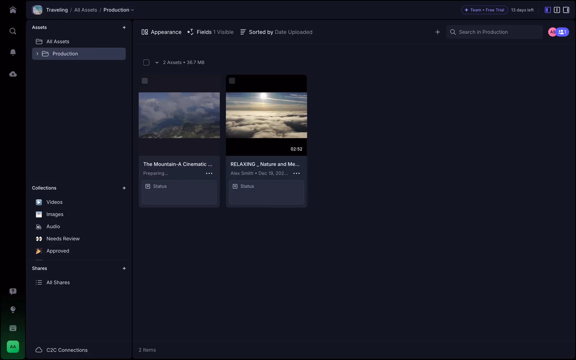
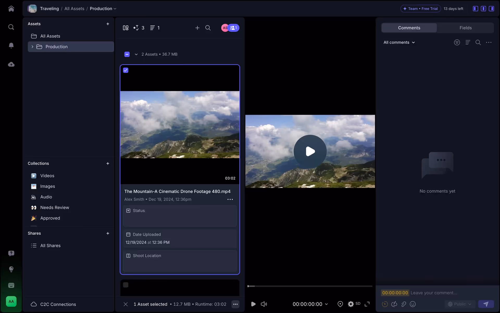
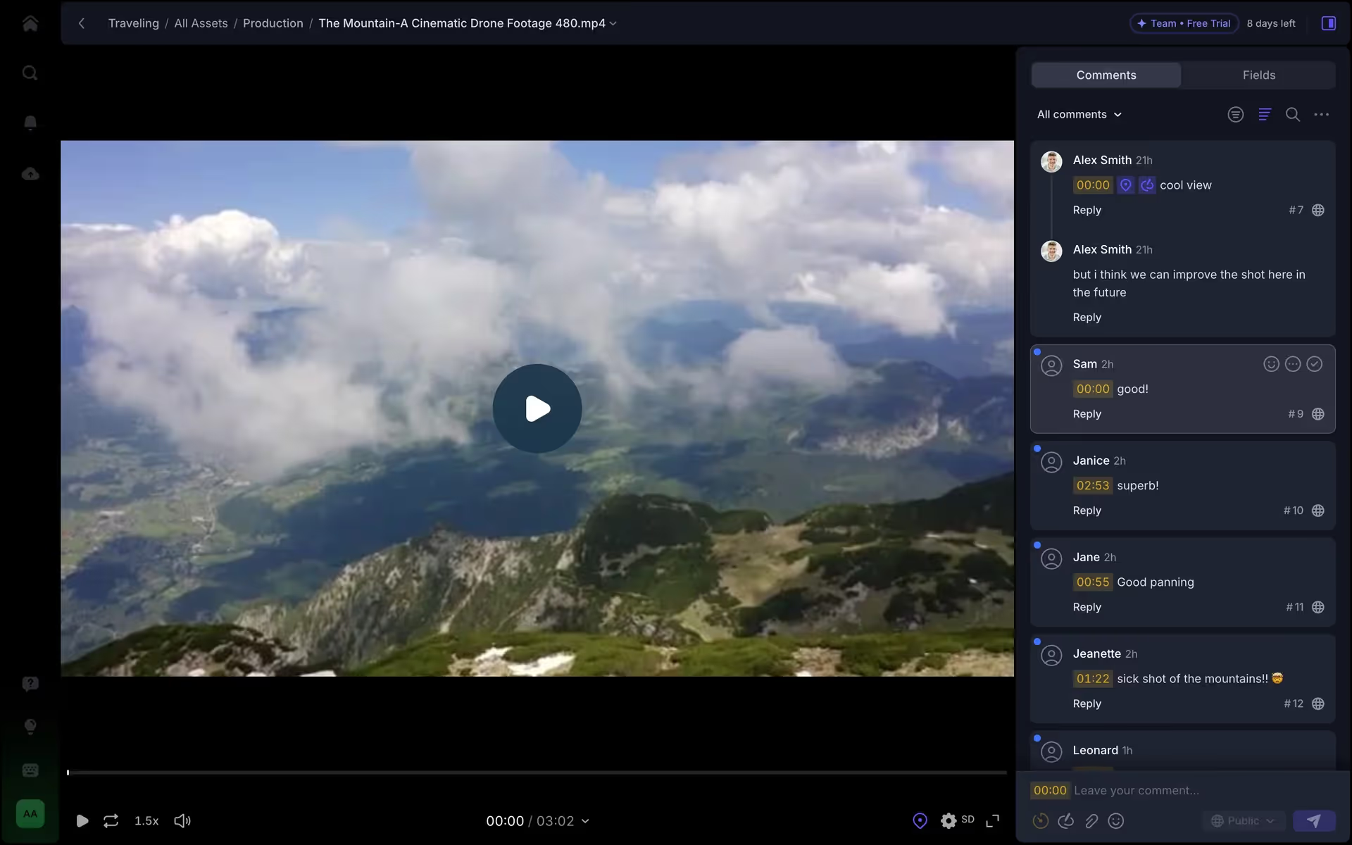
Frame.io is a cloud-based platform for creative collaboration and media asset management. Its branding features a modern palette of Dodger Blue, Cinder, Waterloo, Salmon, Alabaster, and White. On our platform, you can easily copy these colors in Hex, CMYK, RGB, and more.
Frame.io's primary colors are a vibrant Dodger Blue (#5B53FF) and a deep Cinder (#0D0D18), balanced with supporting shades of Waterloo (#81859F), Salmon (#FC856D), Alabaster (#FCFCFC), and White (#FFFFFF), giving you a versatile toolkit for your projects.
Frame.io's signature blue-violet embodies the creative energy and seamless collaboration at the core of their platform. This vibrant hue is grounded by a professional dark theme and accented with energetic salmon, creating a focused yet approachable environment to streamline your creative workflow.
Frame.io's professional color palette is thoughtfully chosen to reflect its core mission of enabling fast, secure, and high-quality creative workflows—a principle we believe helps inspire great design.
Frame.io’s color palette is intentionally crafted to guide your creative workflow. We see how their vibrant blue directs you to key actions, while the high-contrast, neutral tones create a focused environment that keeps your work front and center.
To build on Frame.io's vibrant blue, we suggest exploring a sunny yellow for a high-contrast pop of energy, or a muted teal to introduce a more sophisticated and balanced feel to your designs.
Beyond Frame.io, you can explore our curated brand colors page to see palettes from other top companies. We also offer access to thousands of UI designs from various brands, providing endless inspiration for your next color combination.
Mobbin keeps you at the forefront of design with our extensive, constantly updated library of mobile and web UI/UX patterns. By exploring the latest trends in everything from color palettes to intricate user flows, you can easily see what leading apps are doing and stay ahead of the curve in the ever-evolving design industry.
You can try Mobbin today for free for as long as you like, or get full access with any of our paid plans.
Use Mobbin for free as long as you like or get full access with any of our paid plans.


