#1db954
Copy
Copied


foodpanda is an online platform connecting users to vendors for ordering meals, groceries, and more. foodpanda's branding prominently features colors like Mine Shaft (#222222), White Lilac (#FAFBFD), and Razzmatazz (#D70F64). You can easily copy foodpanda's colors in Hex, CMYK, RGB, and other popular formats on this page.
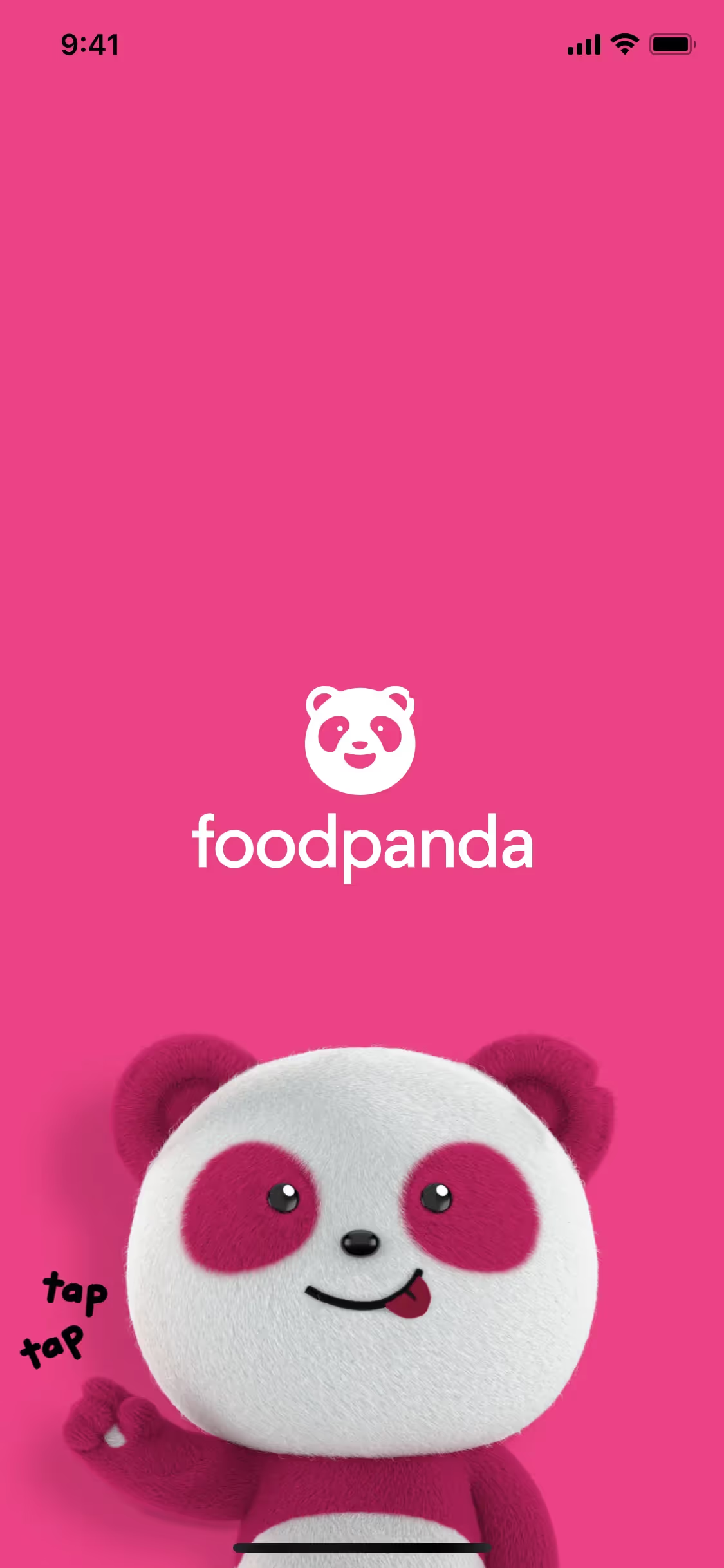
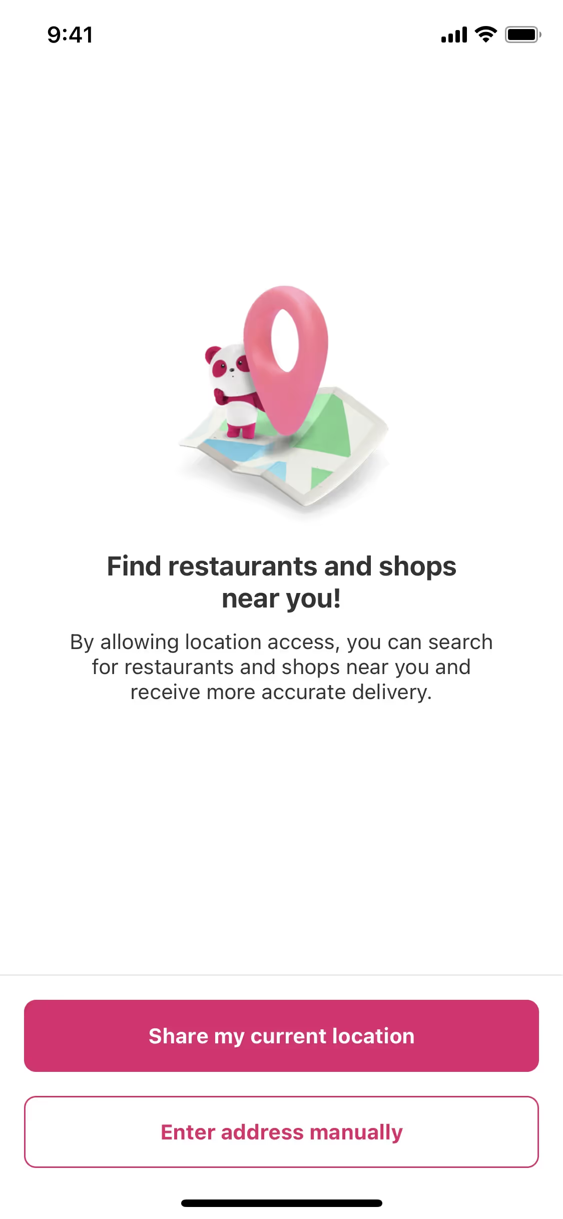
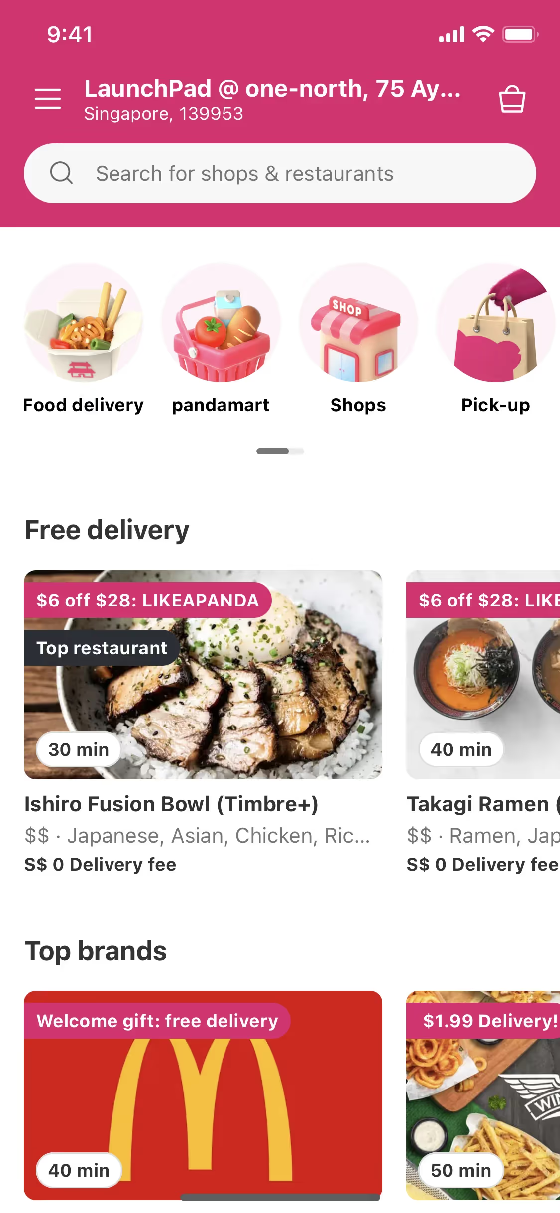
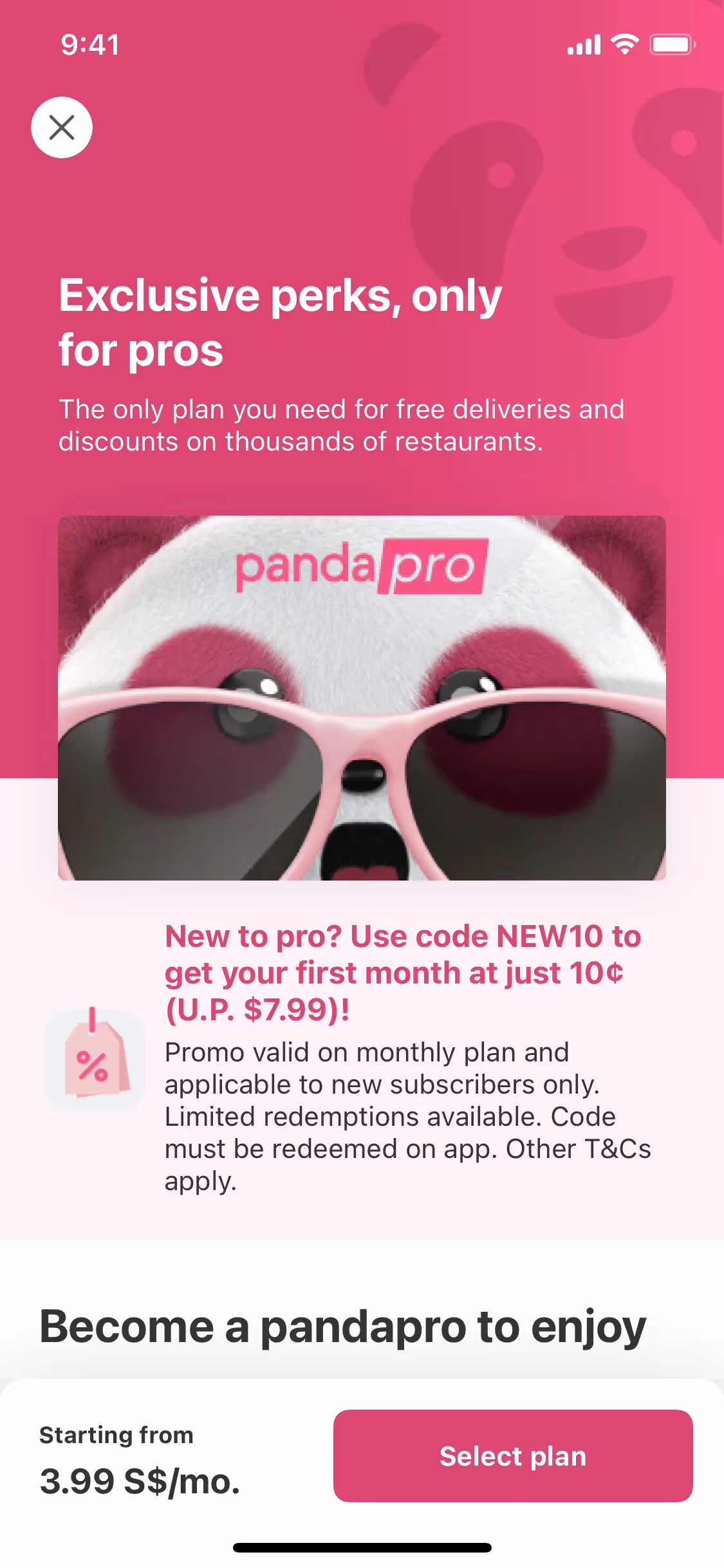
The main colors in foodpanda's color palette are Mine Shaft (#222222), White Lilac (#FAFBFD), and Razzmatazz (#D70F64). These vibrant and contrasting hues help create a visually appealing and recognizable brand identity.
The primary color in foodpanda's app, Mine Shaft (#222222), conveys a sense of sophistication and reliability, aligning with the brand's commitment to delivering quality service. This dark, almost black hue provides a strong, stable foundation that contrasts beautifully with the vibrant Razzmatazz (#D70F64), which injects energy and excitement into the user experience. Complementing these, White Lilac (#FAFBFD) adds a touch of freshness and clarity, ensuring the interface remains clean and user-friendly. Together, these colors create a cohesive and engaging visual identity that resonates with foodpanda's dynamic and dependable brand image.
foodpanda's color scheme, featuring its distinctive pink hue, was chosen to stand out in the competitive food delivery market. The vibrant color not only grabs attention but also evokes feelings of excitement and appetite, aligning with the brand's energetic and dynamic identity.
foodpanda uses color psychology to create a vibrant and engaging user experience. The bold Razzmatazz pink draws your attention to key actions like ordering and signing up, while the neutral White Lilac and Mine Shaft provide a clean, trustworthy backdrop that enhances readability and focus. This strategic use of colors not only guides your actions but also fosters a sense of excitement and reliability, making the interface both appealing and functional.
To complement foodpanda's primary color (#222222), consider using shades like teal (#008080) for a refreshing contrast, or mustard yellow (#FFDB58) to add warmth and vibrancy. These colors can create a balanced and visually appealing palette that enhances the brand's existing aesthetic.
On Mobbin’s brand colors page, you can explore a curated list of brand color palettes from top companies. We also offer access to thousands of other UI designs and interfaces from various brands, making it a great resource for finding new color combinations and getting inspiration from real-world examples.
Mobbin helps you stay up-to-date with the latest UI/UX trends by offering an extensive, constantly updated collection of mobile and web design patterns. From color usage to user flows, our platform showcases the latest trends in UI/UX design, allowing you to easily explore current design practices and stay ahead in the industry.
Ready to elevate your design game? Try Mobbin today for free as long as you like, or get full access with any of our paid plans.
Use Mobbin for free as long as you like or get full access with any of our paid plans.


