#1db954
Copy
Copied

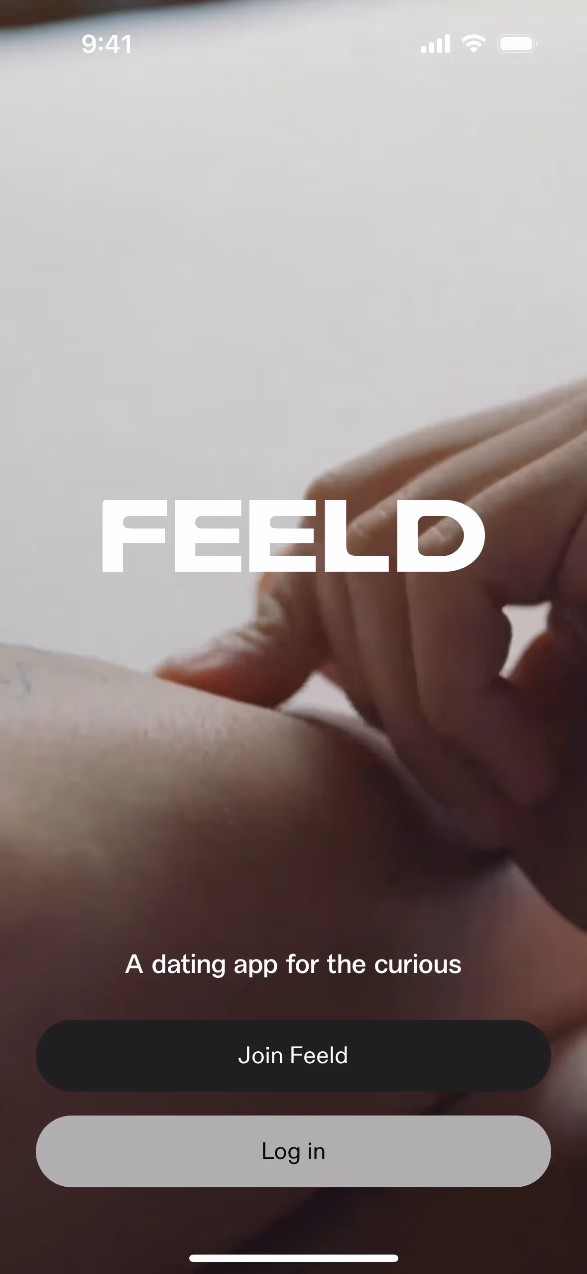
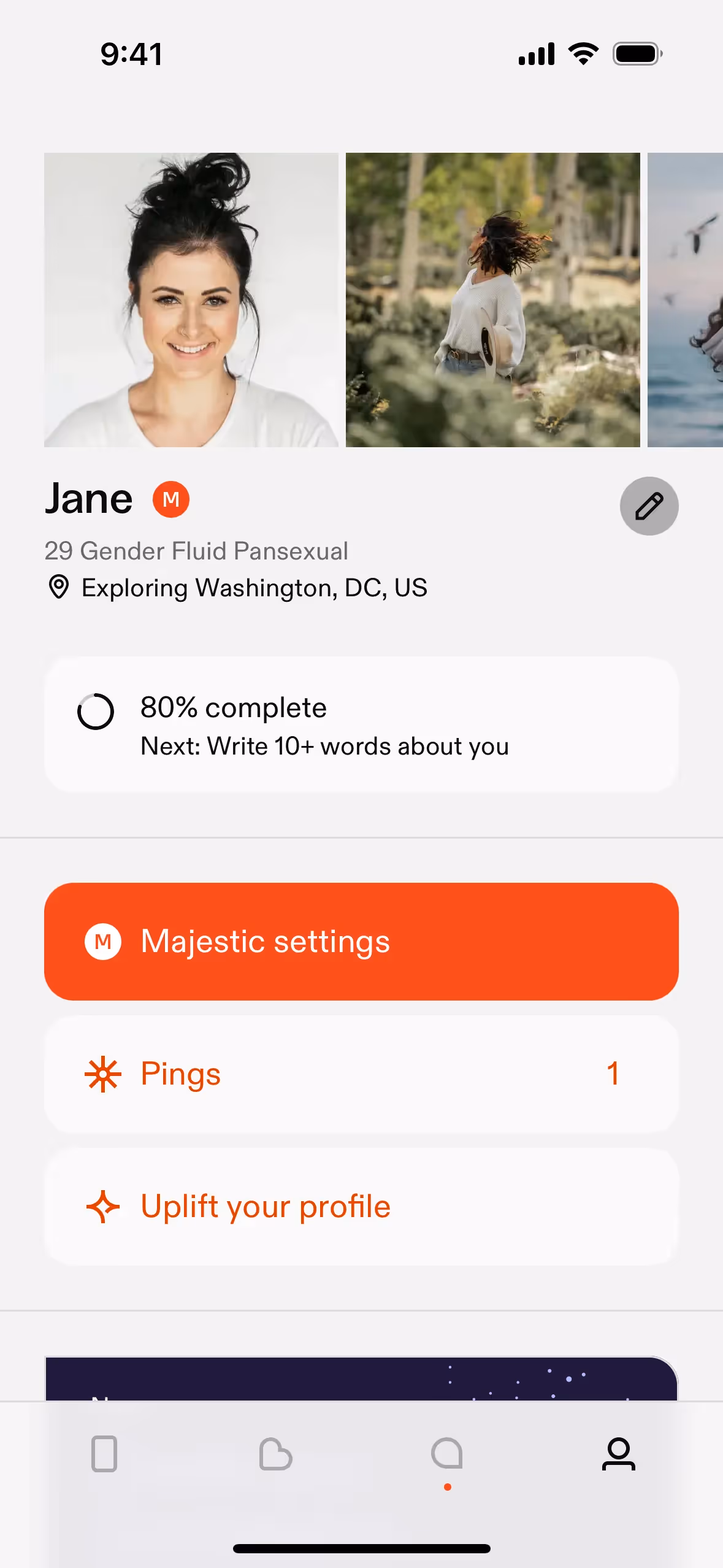
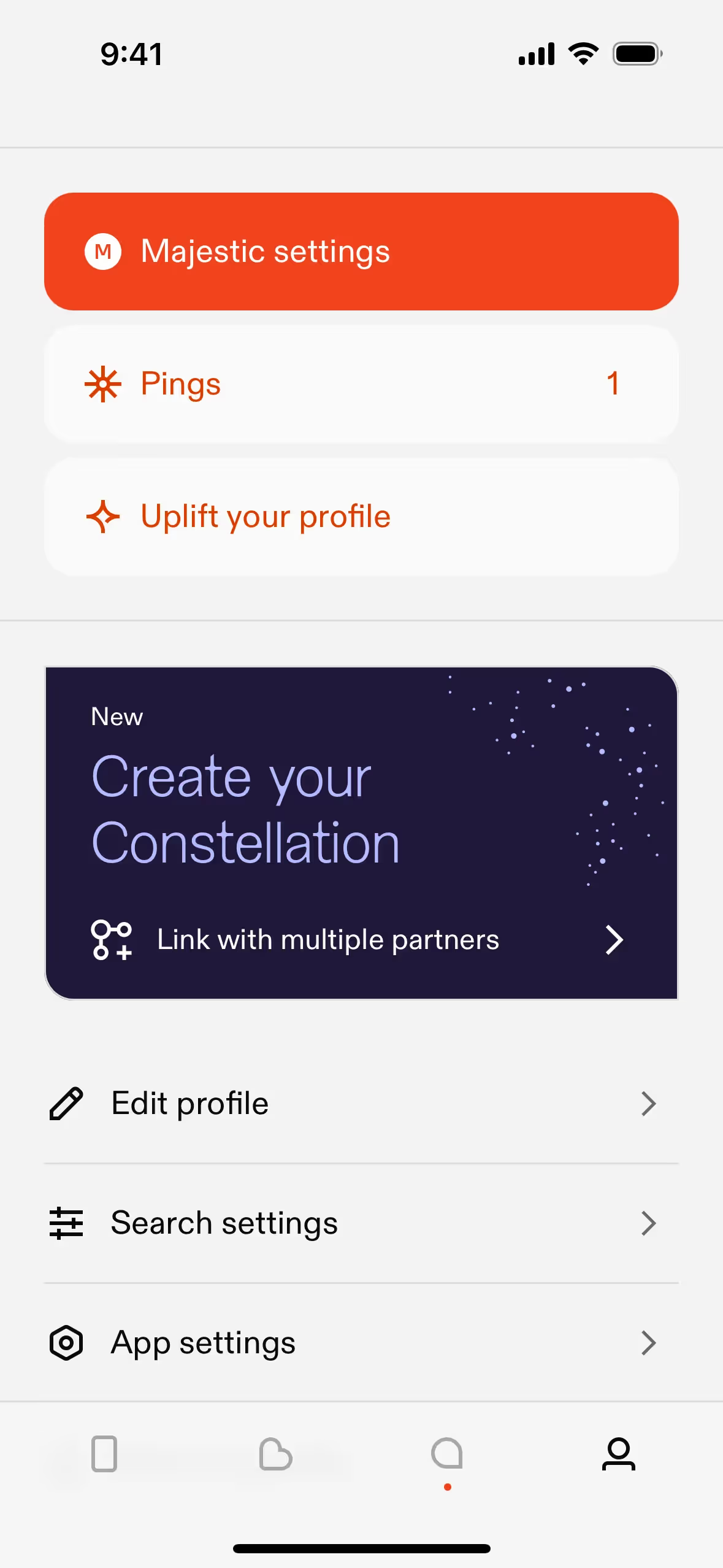
Feeld Ltd. is behind the dating app Feeld, for open-minded and curious individuals. Its branding and interface designs feature a palette of Cape Cod, White, and Mule Fawn. Here on our platform, you can easily copy these colors in Hex, CMYK, RGB, and more.
Feeld's color palette is grounded in a sophisticated trio of colors. We've identified their primary shades as Cape Cod (#484E4E), a clean White (#FFFFFF), and the earthy Mule Fawn (#92572B), offering a versatile base for your design explorations.
Feeld's primary Cape Cod gray sets a mature and sophisticated stage for open exploration, creating a grounded environment for you. This thoughtful choice is supported by an earthy Mule Fawn, which introduces a touch of human warmth and intimacy to the experience.
While Feeld hasn't publicly detailed the origin of its color scheme, the palette was clearly chosen to embody its brand ethos of curiosity and open-minded connection. It’s a powerful example of how a focused color scheme can build an identity that feels both bold and intimate.
Feeld’s earthy and muted palette creates a sophisticated and grounded atmosphere that fosters intimacy and authenticity. This steers you away from gamified swiping and towards more meaningful connections, aligning with the app's core philosophy.
To create a dynamic contrast with Feeld's primary dark grey, we'd recommend a vibrant accent like a coral pink or an electric blue. For a more subtle, sophisticated palette, you could introduce a muted sage green to create balance and a sense of calm.
Explore curated palettes from top companies on our brand colors page, or browse thousands of real-world UI designs in our library to discover your next great color combination.
Mobbin keeps you at the forefront of design with our extensive, constantly updated library of mobile and web app screenshots. By exploring the latest real-world examples, from innovative color palettes to seamless user flows, you can easily spot emerging UI/UX trends and keep your work fresh and relevant.
Why not try Mobbin today? You can explore for free as long as you like, or unlock full access with one of our paid plans.
Use Mobbin for free as long as you like or get full access with any of our paid plans.


