#1db954
Copy
Copied


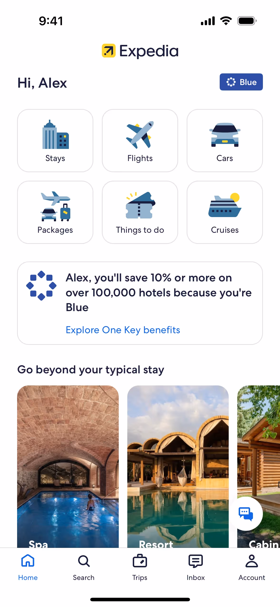
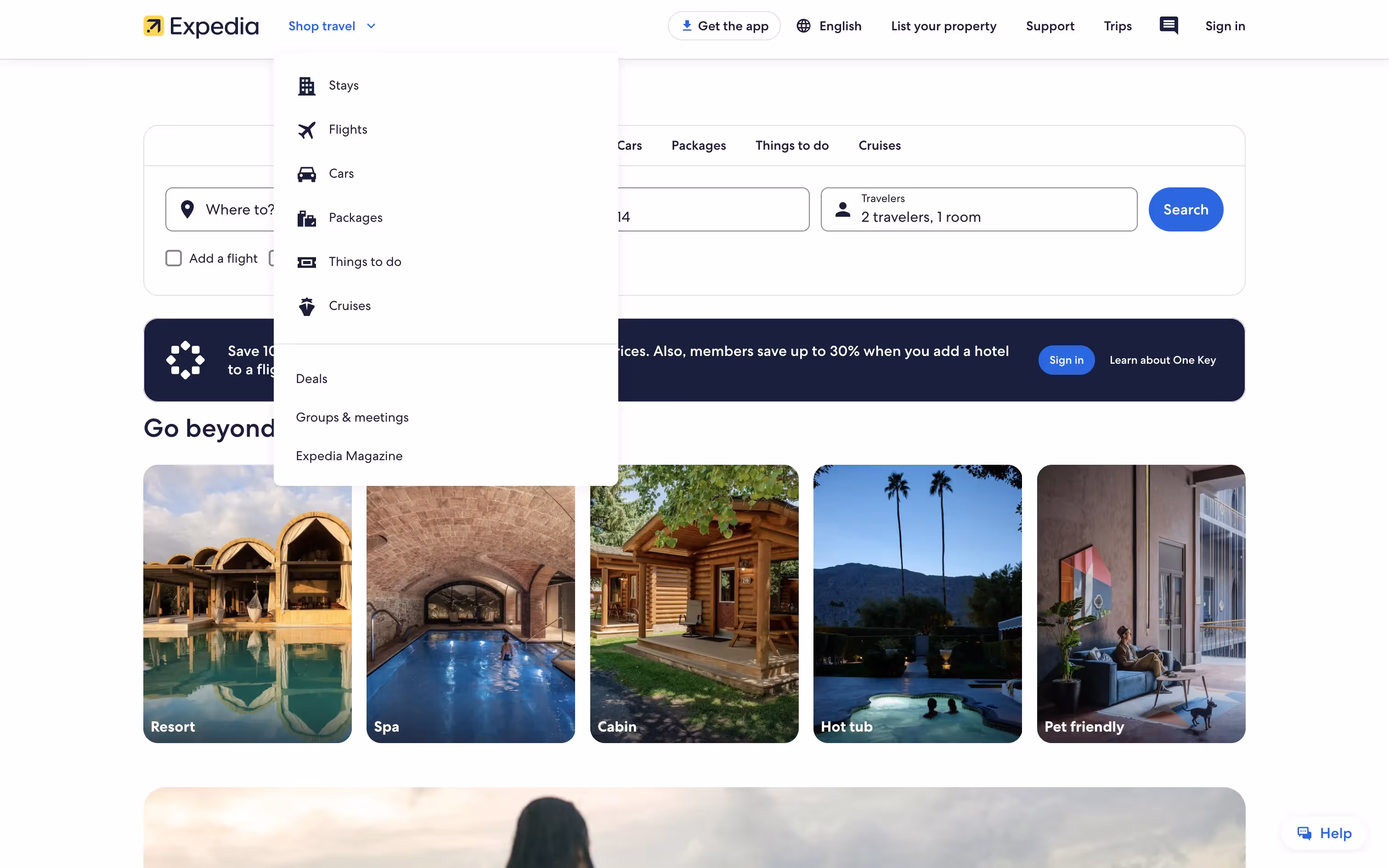
Expedia is a major online travel agency offering a wide range of travel-related services. The brand's interface prominently features blue (#1E243A) and yellow (#FEBF4F) colors, enhancing its visual appeal. You can easily copy Expedia's colors in Hex, CMYK, RGB, and other popular formats on this page.
Expedia's main colors are a deep blue (#1E243A) and a vibrant yellow (#FEBF4F). These colors work together to create a striking and memorable visual identity.
Expedia's primary color, #1E243A, conveys a sense of trust, reliability, and sophistication, aligning with the brand's identity as a dependable travel companion. This deep blue hue evokes feelings of calm and stability, essential for a platform that helps you plan your journeys. Complementing this, the vibrant yellow (#FEBF4F) adds a touch of warmth and optimism, enhancing the overall message of adventure and excitement.
Expedia's color scheme, while not explicitly detailed in available sources, likely evolved to reflect its identity as a comprehensive travel platform. The choice of colors is influenced by the need to convey trust, reliability, and a sense of adventure, aligning with the brand's focus on transparency and convenience for travelers like you.
Expedia strategically uses blue and yellow in its interface designs to guide your actions and influence decisions. The calming blue (#1E243A) fosters trust and reliability, while the vibrant yellow (#FEBF4F) highlights key actions and promotions, creating a balanced and engaging user experience.
To complement Expedia's primary color (#1E243A), consider using shades like coral (#FF6F61) for a vibrant contrast, or teal (#008080) for a balanced, harmonious effect. These colors can enhance your design by adding depth and visual interest.
On Mobbin’s brand colors page, you can explore a curated list of brand color palettes from top companies. We also offer access to thousands of other UI designs and interfaces from various brands, making it a great resource for finding new color combinations and getting inspiration from real-world examples.
Mobbin offers an extensive, constantly updated collection of mobile and web design patterns, showcasing the latest trends in UI/UX design, from color usage to user flows. By using Mobbin, you can easily explore current design practices and stay ahead of trends in the industry.
Don't miss out—try Mobbin today for free as long as you like, or get full access with any of our paid plans.


Use Mobbin for free as long as you like or get full access with any of our paid plans.


