#1db954
Copy
Copied

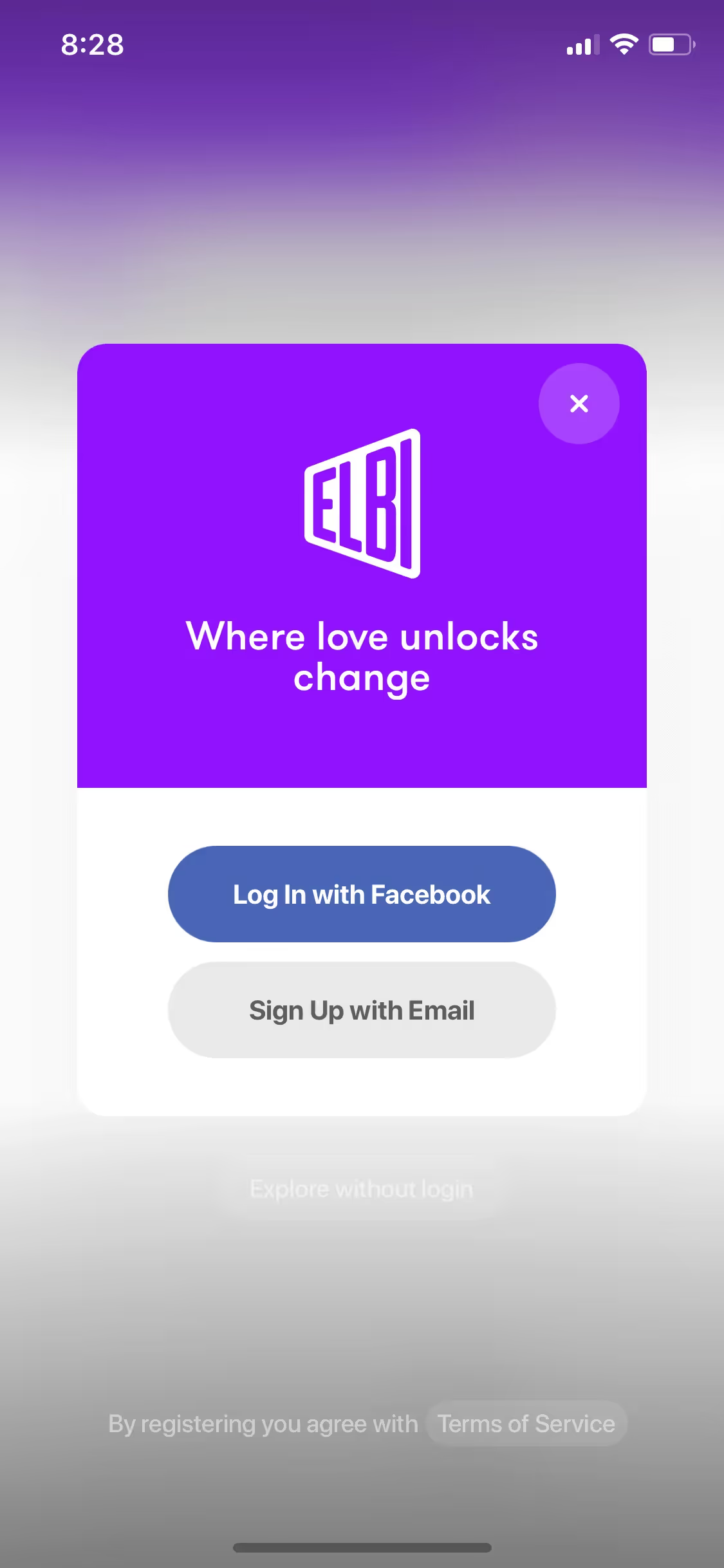
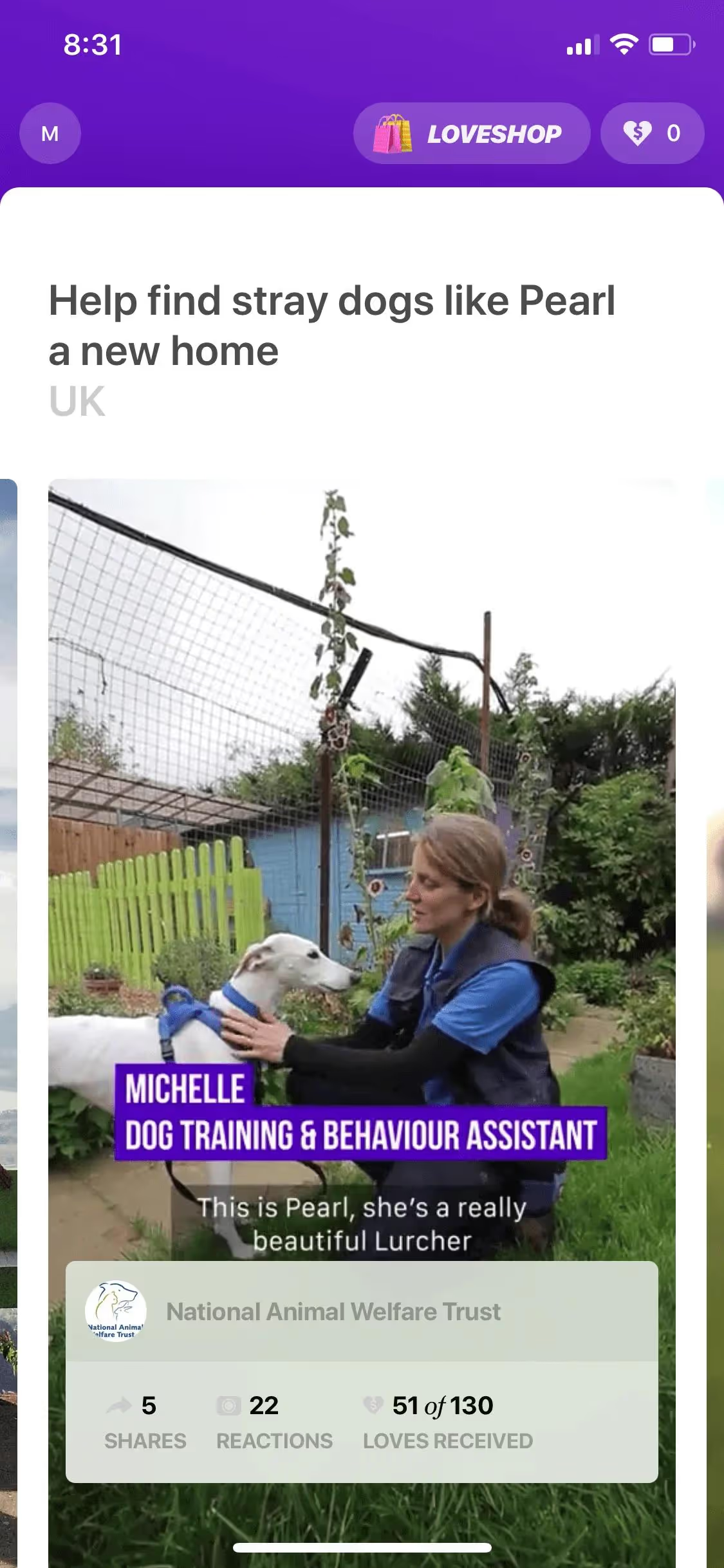
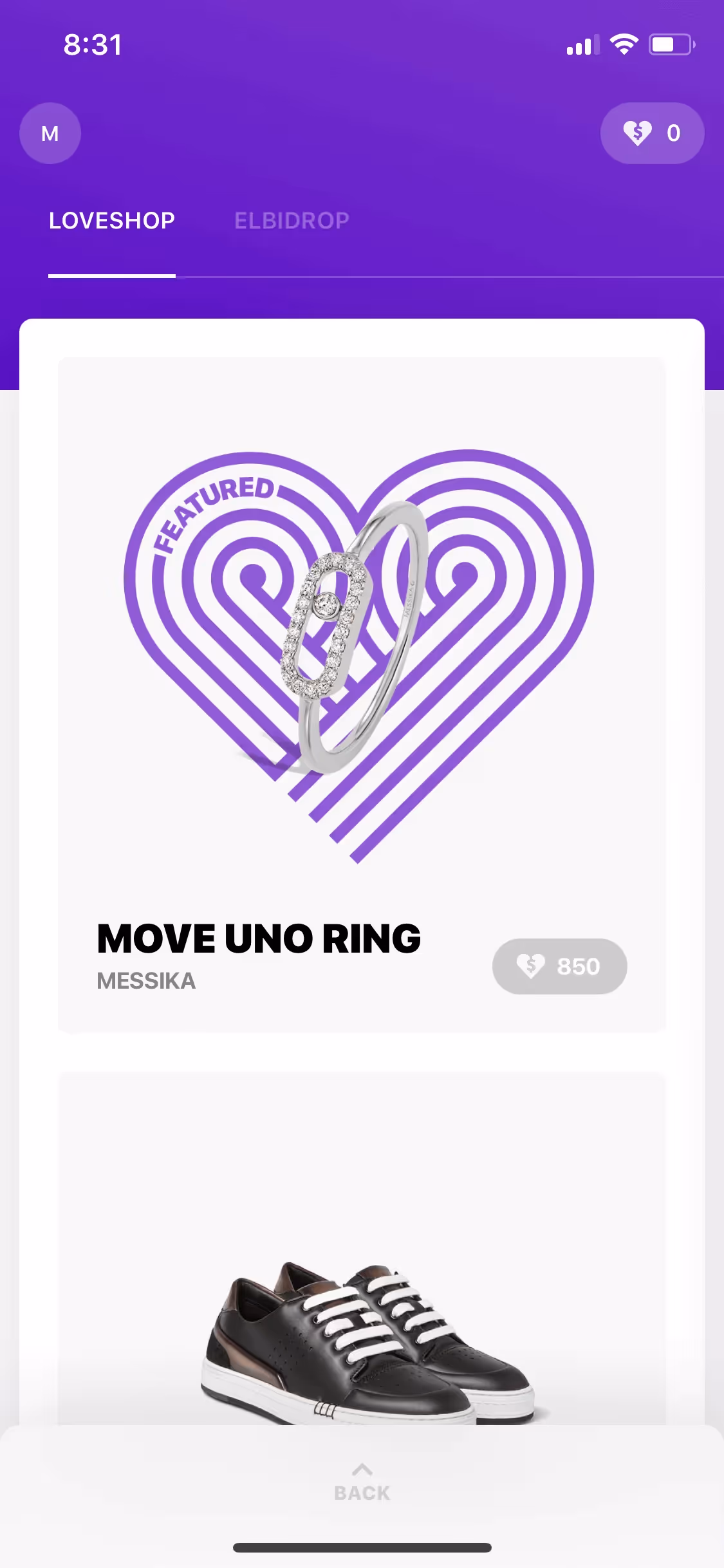
Elbi Digital is an AI-first communication and education platform for creators and brands. The platform's branding and interface designs prominently feature the colors Mine Shaft (#333333), White (#FFFFFF), and Purple (#5A00CF). You can easily copy Elbi Digital's colors in Hex, CMYK, RGB, and other popular formats on this page.
Elbi Digital's color palette primarily features Mine Shaft (#333333), White (#FFFFFF), and Purple (#5A00CF). These colors create a striking and versatile visual identity that can inspire your design projects.
The primary color, Mine Shaft (#333333), in Elbi Digital's app or website, conveys a sense of sophistication and reliability, aligning with the brand's identity of trust and professionalism. Complementing this, the use of White (#FFFFFF) and Purple (#5A00CF) enhances clarity and creativity, respectively, creating a balanced and engaging user experience.
Elbi Digital's color scheme emerged from a desire to create a visually cohesive and engaging platform for creators and brands. While specific historical details and influences behind the choice of colors are not explicitly documented, the consistent use of the name "Elbi" and the tagline "AI-first communication and education platform for creators and brands" suggests a focus on modernity and innovation in their visual identity.
Elbi Digital strategically uses colors like Mine Shaft, White, and Purple to create a cohesive and engaging user experience. These colors guide your actions, influence your decisions, and enhance the overall interface design, ensuring a seamless and intuitive interaction with the platform.
To complement Elbi Digital's primary color (#333333), consider using shades like teal (#008080) for a refreshing contrast, mustard yellow (#FFDB58) for a vibrant pop, or soft coral (#FF7F50) to add warmth and balance. These colors can enhance your design by creating a dynamic and visually appealing palette.
On Mobbin’s brand colors page, you can explore a curated list of brand color palettes from top companies. We also offer access to thousands of other UI designs and interfaces from various brands, making it a great resource for finding new color combinations and getting inspiration from real-world examples.
Mobbin offers an extensive, constantly updated collection of mobile and web design patterns, showcasing the latest trends in UI/UX design, from color usage to user flows. By using Mobbin, you can easily explore current design practices and stay ahead of trends in the industry.
Try Mobbin today for free as long as you like, or get full access with any of our paid plans.
Use Mobbin for free as long as you like or get full access with any of our paid plans.


