#1db954
Copy
Copied


Duolingo is a popular language learning platform. Its branding and interface designs prominently feature Dodger Blue (#1CB0F6), White (#FFFFFF), and Bright Green (#58CC02). You can easily copy Duolingo's colors in Hex, CMYK, RGB, and other popular formats in this page.
Duolingo's color palette primarily features Dodger Blue (#1CB0F6), White (#FFFFFF), and Bright Green (#58CC02). These vibrant colors help create an engaging and friendly user experience.
Duolingo's primary color, Dodger Blue (#1CB0F6), conveys a sense of trust, clarity, and optimism, aligning perfectly with the brand's mission to make language learning accessible and enjoyable. This vibrant blue is complemented by Bright Green (#58CC02), which symbolizes growth and energy, reinforcing the app's dynamic and engaging learning environment. White (#FFFFFF) is used to create a clean, user-friendly interface, ensuring that the focus remains on the educational content.
Duolingo's color scheme, characterized by its vibrant green, was chosen to evoke a sense of playfulness and approachability. The choice of colors was influenced by the need to create a friendly and engaging learning environment, making language learning feel less intimidating and more enjoyable for users.
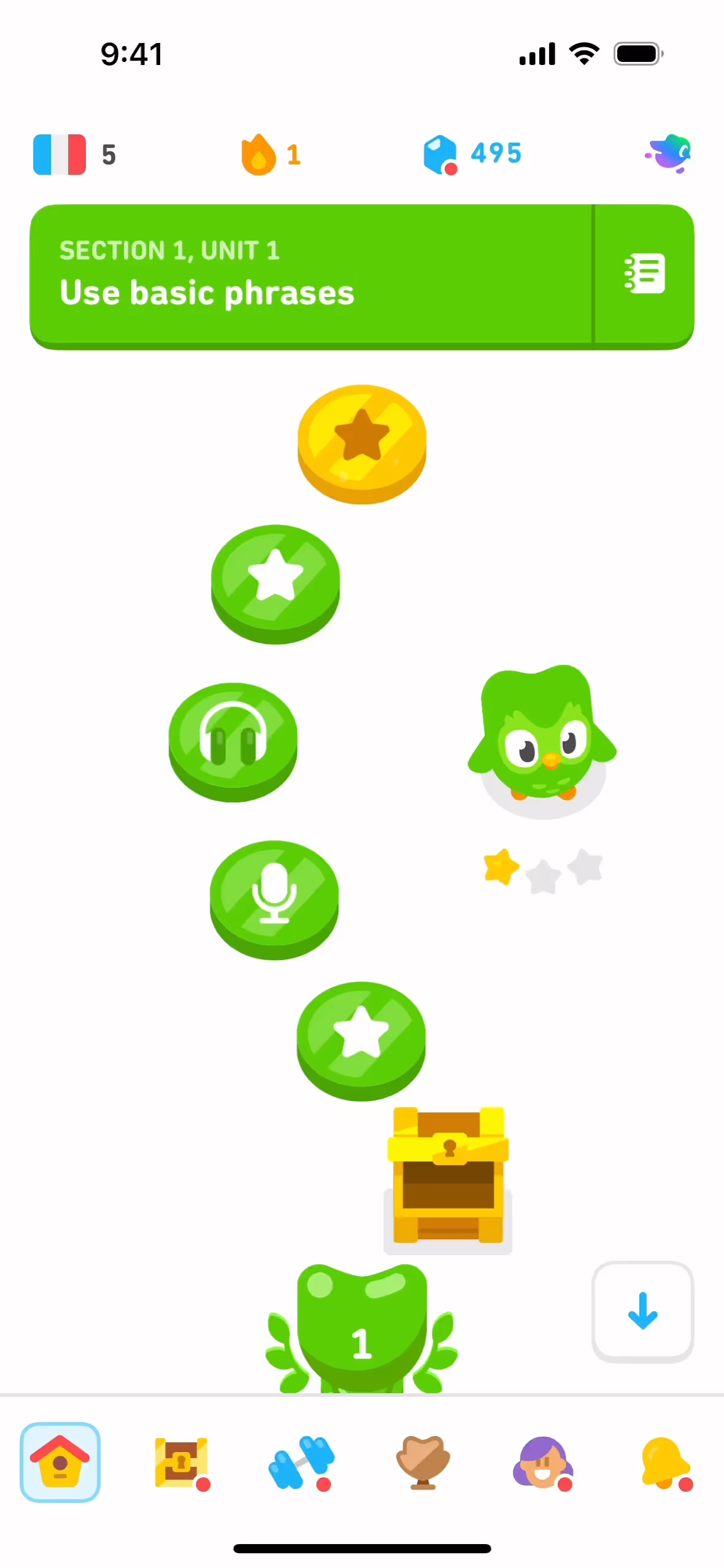
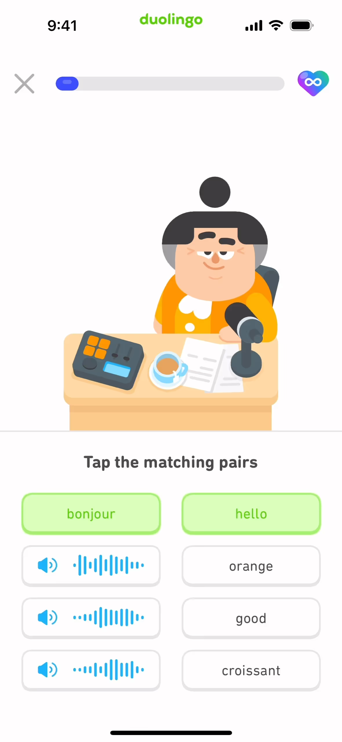
Duolingo strategically uses colors like Dodger Blue, White, and Bright Green to guide your actions and enhance your learning experience. Dodger Blue often highlights interactive elements, drawing your attention to important features, while Bright Green is used to signify success and progress, encouraging you to continue. The use of White provides a clean, uncluttered background that makes other colors stand out, ensuring a visually engaging and intuitive interface.
To complement Duolingo's primary color (#1CB0F6), consider incorporating shades like coral (#FF6F61) for a vibrant contrast, or soft lavender (#E6E6FA) to create a calming balance. These colors can enhance the visual appeal and provide a fresh, dynamic look to your designs.
On Mobbin’s brand colors page, you can explore a curated list of brand color palettes from top companies. We also offer access to thousands of other UI designs and interfaces from various brands, making it a great resource for finding new color combinations and getting inspiration from real-world examples.
Mobbin offers an extensive, constantly updated collection of mobile and web design patterns, showcasing the latest trends in UI/UX design, from color usage to user flows. By using Mobbin, you can easily explore current design practices and stay ahead of trends in the industry.
Ready to elevate your design game? Try Mobbin today for free as long as you like, or get full access with any of our paid plans.


Use Mobbin for free as long as you like or get full access with any of our paid plans.


