#1db954
Copy
Copied


Dig Wells, Inc.'s app, Matter, is a modern read-later tool for avid readers. Its branding and interface designs primarily use Cod Gray (#0B0B0B) and Gallery (#EDEDED). You can easily copy these colors in Hex, CMYK, RGB, and other popular formats from this page.
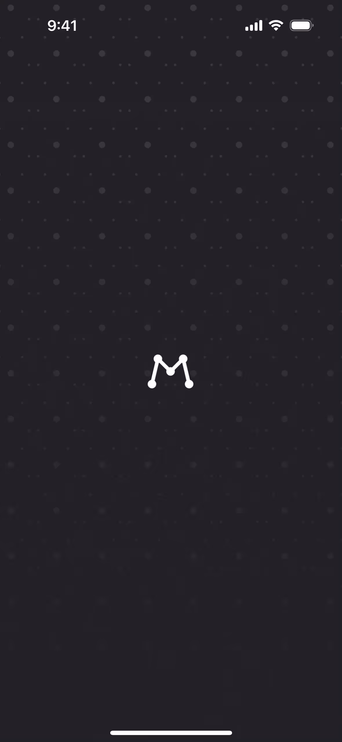
Matter's core color palette is built around two primary colors: Cod Gray (#0B0B0B) and Gallery (#EDEDED). This simple, high-contrast combination provides a clean and focused foundation for your design explorations.
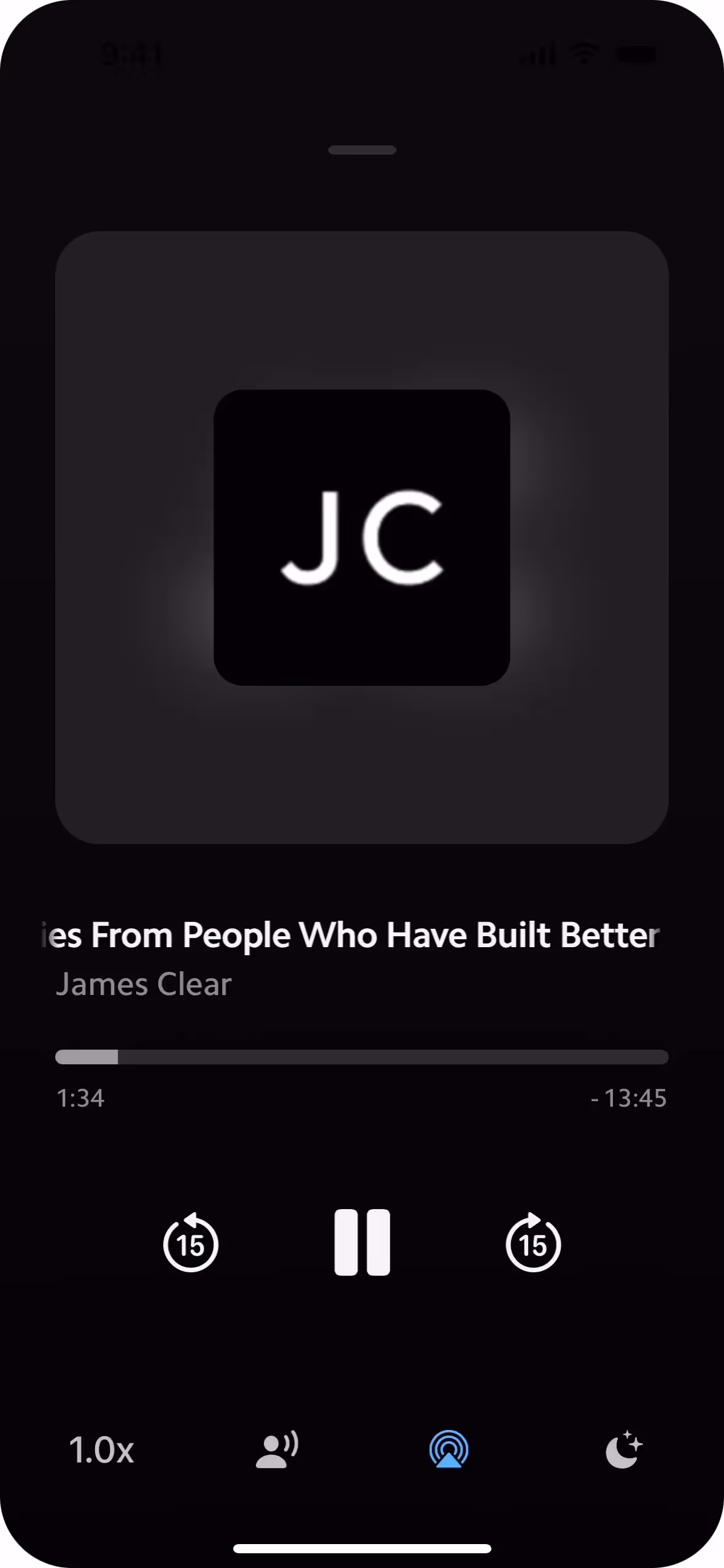
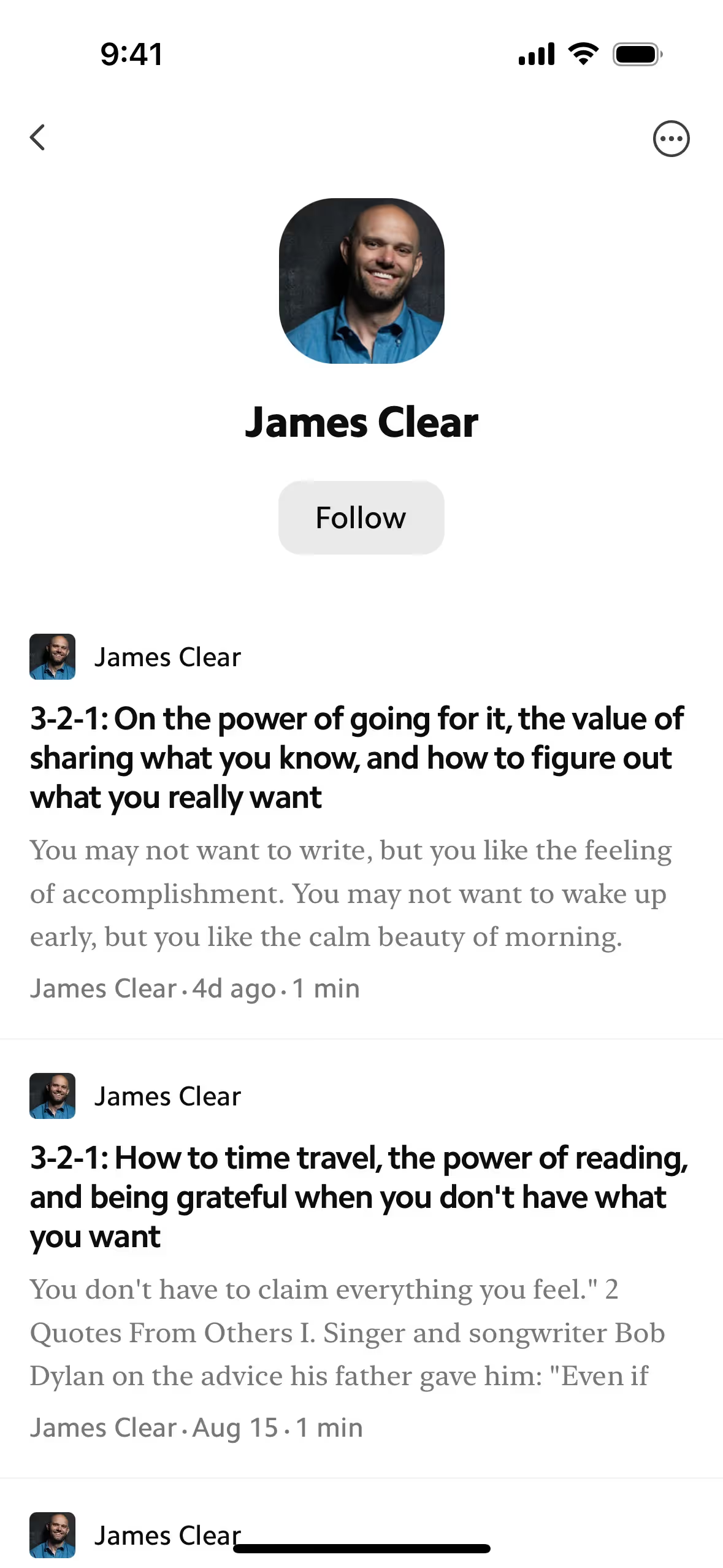
Matter's deep gray (#0B0B0B) grounds your experience in focus and sophistication, letting the content itself be the hero. This is supported by the clean, light gray (#EDEDED) backdrop, a choice we made to ensure a serene and uncluttered space for your ideas.
While the exact history isn't publicly detailed, Matter's color scheme was likely chosen to support a focused, distraction-free reading experience, perfectly aligning with the app's simple and powerful brand identity.
We see Matter's use of Cod Gray and Gallery as a deliberate choice to support a distraction-free reading experience. This high-contrast, minimalist palette helps focus your attention on the content by stripping away unnecessary visual noise.
To make Matter's near-black primary pop, we'd suggest a vibrant accent like cobalt blue for a touch of energy, or warm earth tones like terracotta to create a more sophisticated, balanced feel.
On our brand colors page, you can explore curated color palettes from top companies. We also offer access to thousands of UI designs from various brands, providing endless inspiration for your next color combination from real-world examples.
Mobbin offers an extensive, constantly updated collection of mobile and web design patterns, showing you the latest trends in everything from color usage to user flows. By exploring our curated library, you can easily see current design practices in action and stay ahead of industry trends.
So, why wait? Try Mobbin today for free as long as you like, or get full access with any of our paid plans.

Use Mobbin for free as long as you like or get full access with any of our paid plans.


