#1db954
Copy
Copied


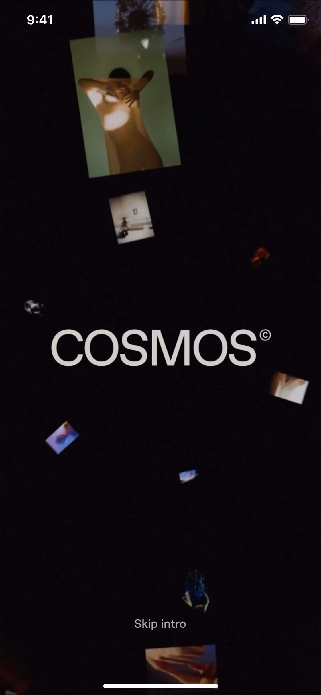
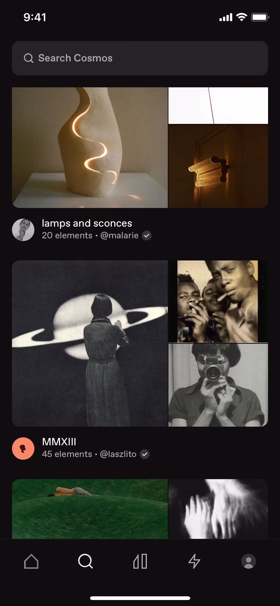
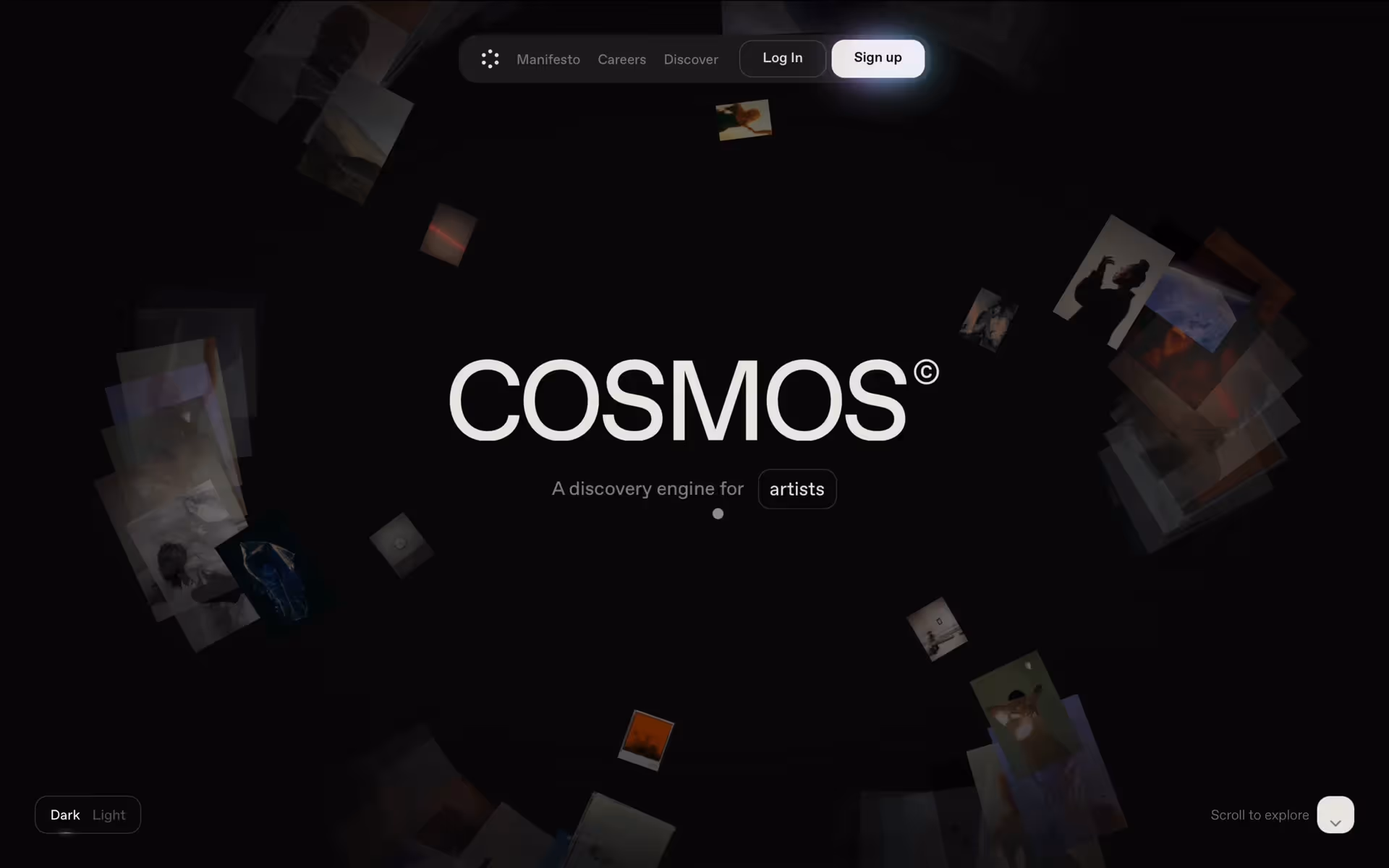
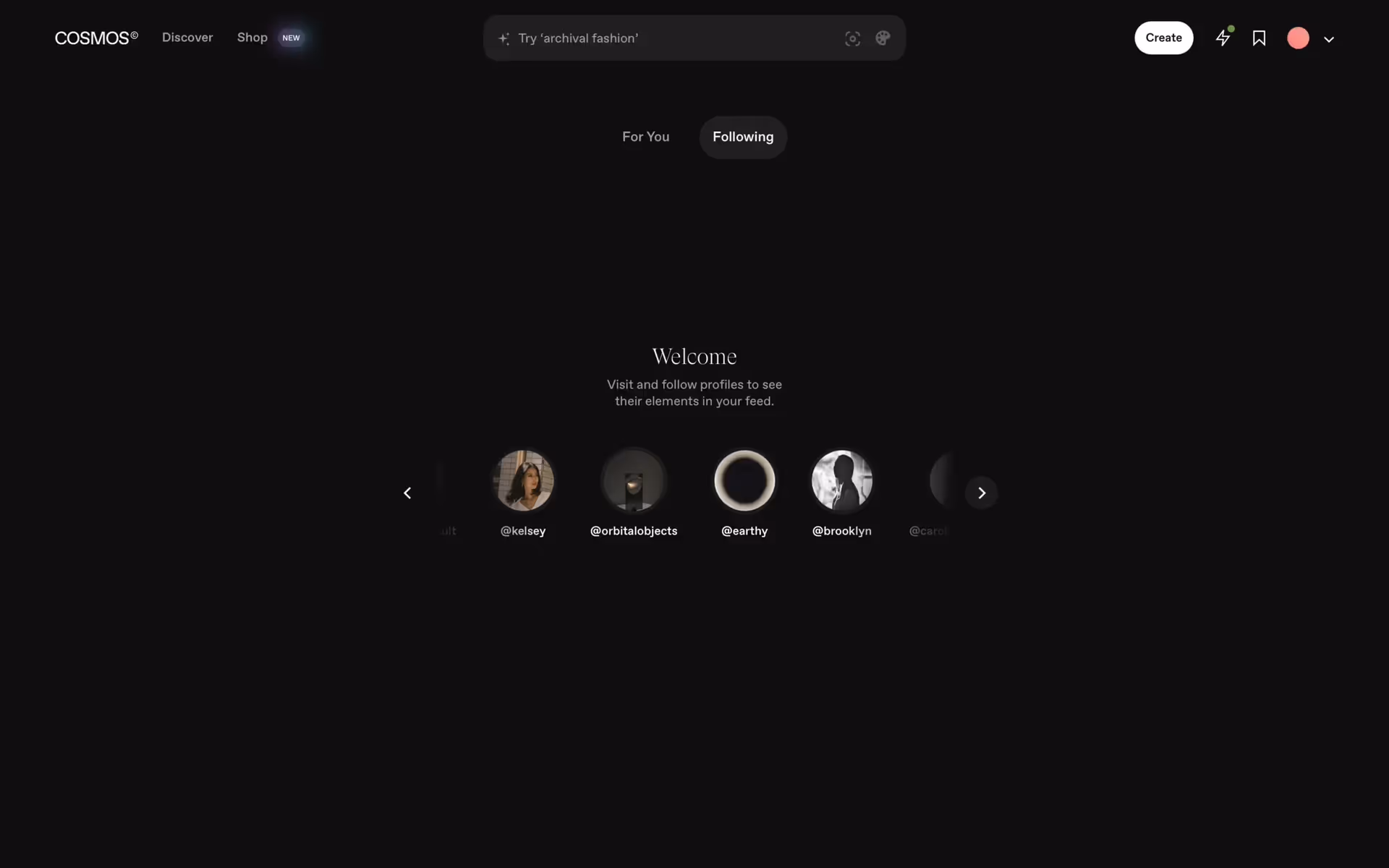
Cosmos is the home you've been searching for to store your ideas. Its branding and interface designs primarily use Dusty Gray (#9B9594) and Westar (#E2DDD5). You can easily copy these colors in Hex, CMYK, RGB, and other popular formats on this page.
Cosmos's main color palette is built around two versatile neutrals: Dusty Gray (#9B9594) and Westar (#E2DDD5). We've found these colors provide a clean and sophisticated foundation to inspire your next design.
We find that Cosmos's primary Dusty Gray conveys a sense of calm focus and timeless sophistication, providing a stable canvas for your creative work. The complementary warmth of Westar enhances this by bringing clarity and a feeling of spaciousness to the interface, helping you stay inspired.
While there isn't public information on the specific history, Cosmos's color palette appears intentionally crafted to foster a focused and immersive environment, making it the ideal digital home for your work and connections.
While Cosmos hasn't publicly detailed the specific color psychology behind its interface, we observe that its use of neutral tones like Dusty Gray and Westar helps create a calm, focused user experience.
For a pop of contrast, you could introduce a deep navy or a rich forest green. Alternatively, earthy tones like terracotta or a muted sage will create a more organic and balanced feel in your designs.
On our brand colors page, you can explore curated color palettes from top companies. We also offer thousands of UI designs from various brands, providing endless inspiration for your next color combination from real-world examples.
Our platform offers an extensive, constantly updated library of mobile and web design patterns, allowing you to see the latest UI/UX trends in action—from evolving color palettes to innovative user flows. By exploring our collection, you can easily keep a pulse on current design practices and stay ahead of the curve in the fast-paced design industry.
Why not try Mobbin today? You can use it for free for as long as you like, or get full access with one of our paid plans.


Use Mobbin for free as long as you like or get full access with any of our paid plans.