#1db954
Copy
Copied

Chime is a financial technology company offering banking services with no monthly fees and fee-free overdraft. The brand's general colors include Mountain Meadow (#1EC677), Bottle Green (#0D4029), Ottoman (#ECF9EE), and White (#FFFFFF). You can easily copy Chime's colors in Hex, CMYK, RGB, and other popular formats on this page.
The main colors in Chime's color palette are Mountain Meadow (#1EC677), Bottle Green (#0D4029), Ottoman (#ECF9EE), and White (#FFFFFF). These colors create a fresh and inviting aesthetic, perfect for inspiring your next design project.
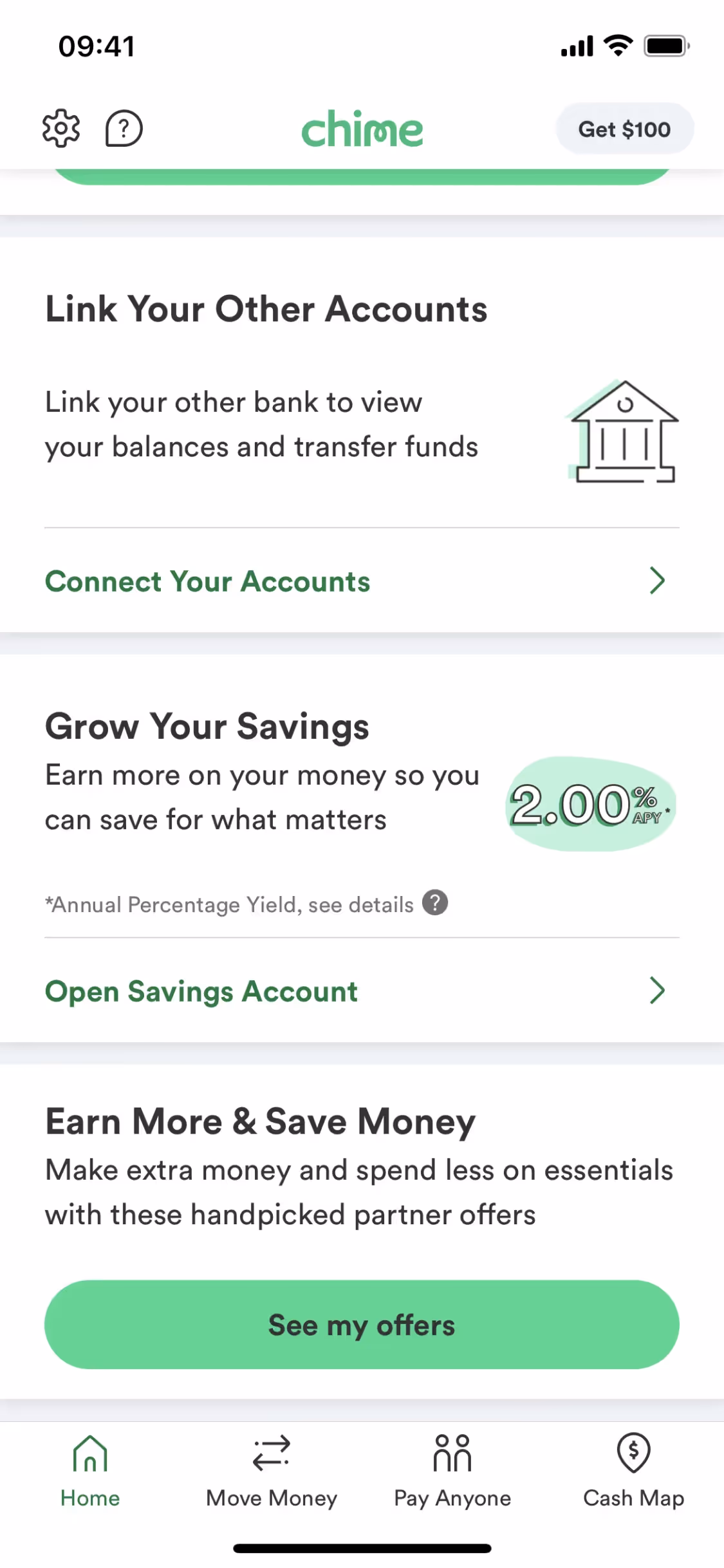
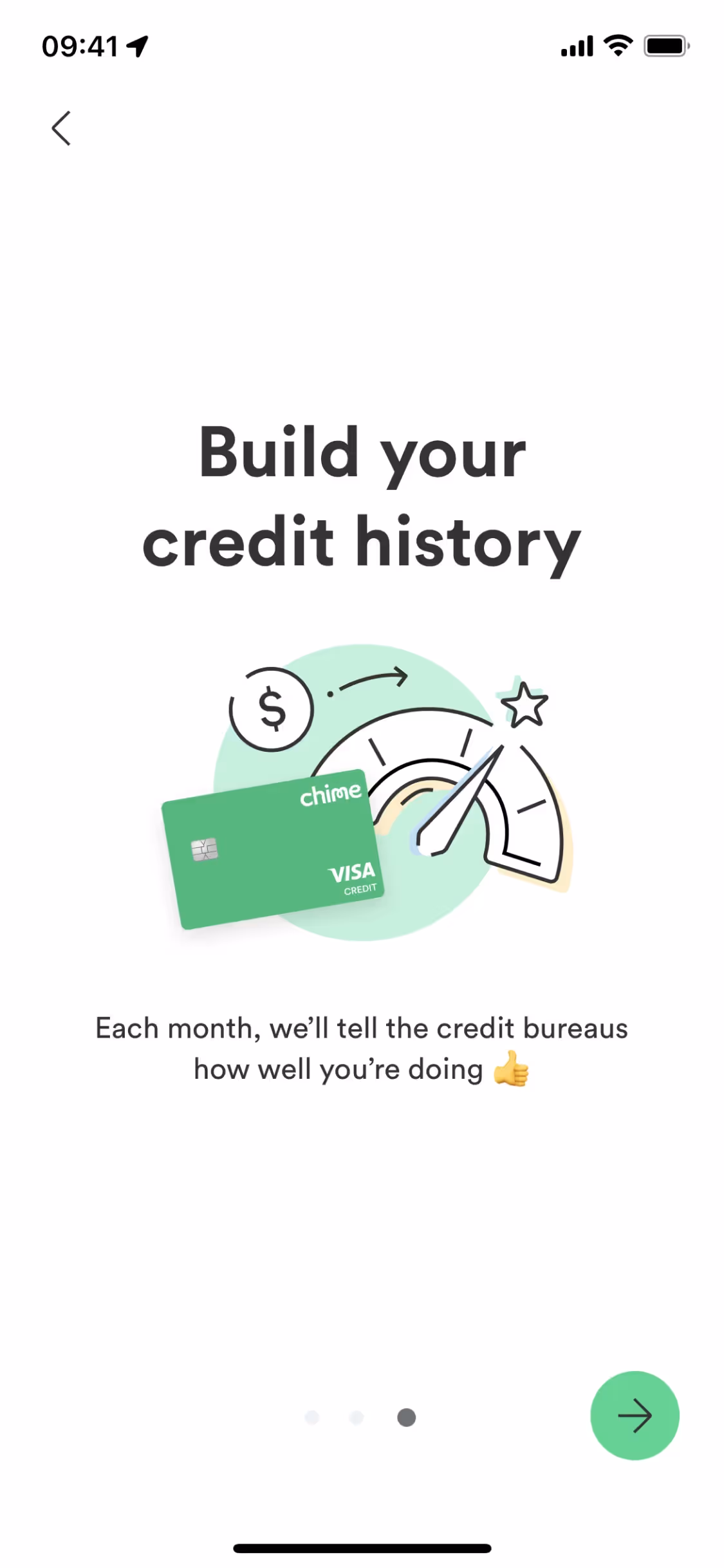
The primary color in Chime's app, Mountain Meadow (#1EC677), conveys a sense of growth, renewal, and financial well-being, aligning perfectly with Chime's brand identity of fostering financial health and empowerment. Complementing this, Bottle Green (#0D4029) adds depth and stability, while Ottoman (#ECF9EE) and White (#FFFFFF) provide a clean, fresh backdrop that enhances readability and user experience.
Chime's color scheme is designed to reflect its modern, user-friendly, and transparent approach to banking. While the specific history and influences behind the choice of colors aren't detailed, the brand's visual identity aligns with its mission to empower users financially and provide a clear, accessible banking experience.
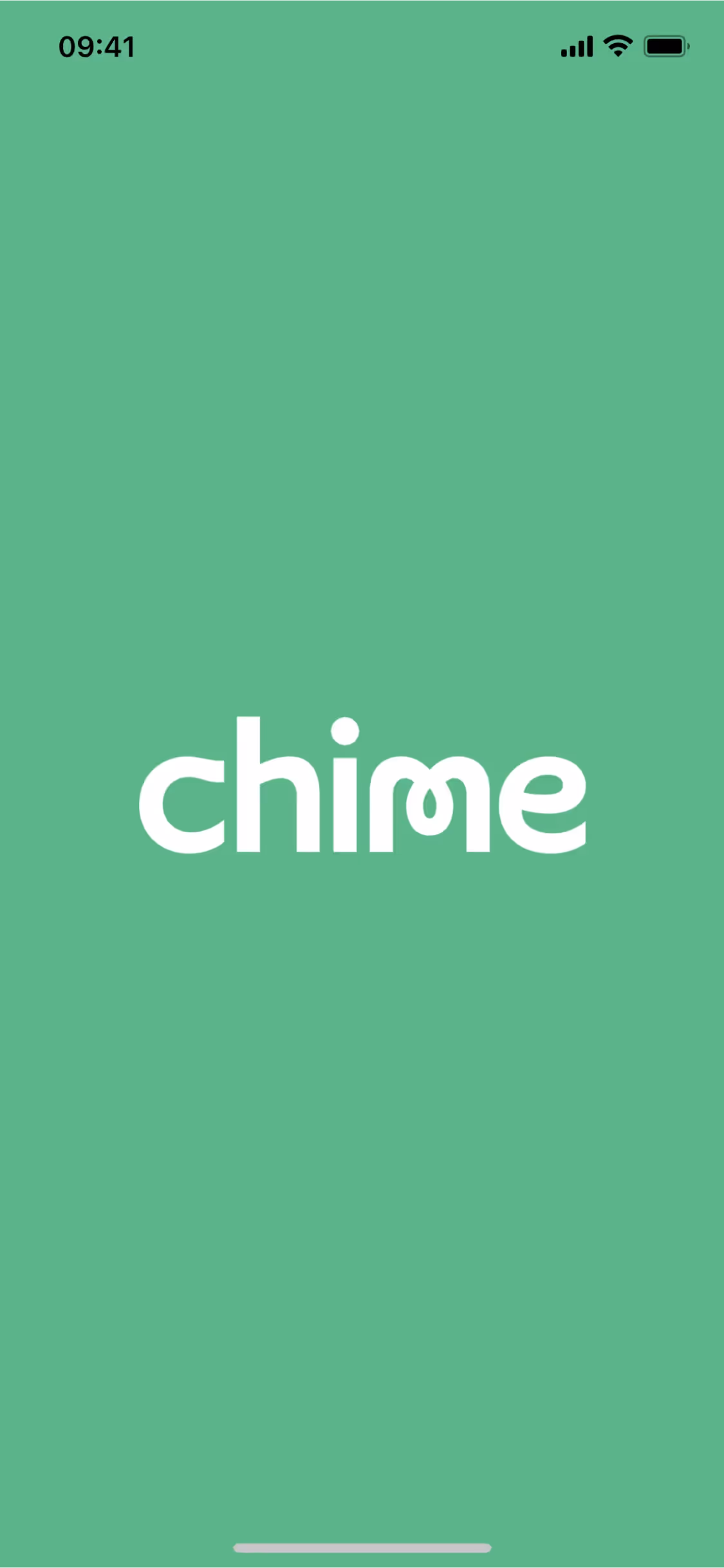
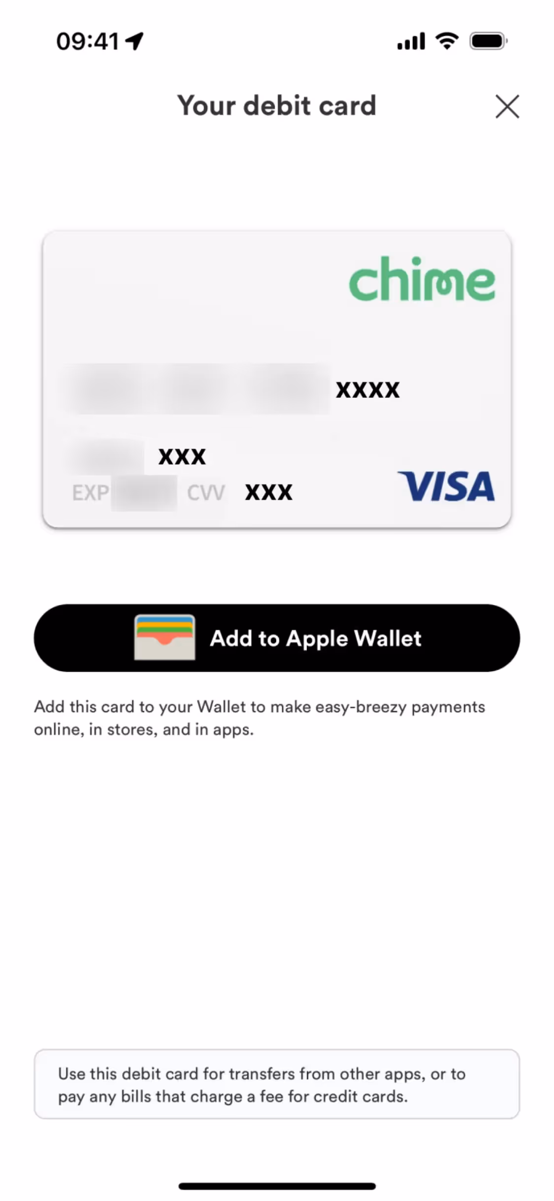
Chime's interface designs leverage the calming and trustworthy hues of Mountain Meadow (#1EC677) and Bottle Green (#0D4029) to create a sense of security and reliability. Ottoman (#ECF9EE) and White (#FFFFFF) are used to maintain a clean, uncluttered look, enhancing readability and guiding your focus towards key actions like signing up or learning more about their services. This strategic use of color not only makes navigation intuitive but also fosters a positive user experience, encouraging engagement and trust.
To complement Chime's primary color (#1EC677), consider using shades like navy blue (#003366) for a strong contrast, soft peach (#FFDAB9) for a warm balance, or light gray (#D3D3D3) for a neutral effect. These colors can enhance your design by creating visual interest and harmony.
On Mobbin’s brand colors page, you can explore a curated list of brand color palettes from top companies. We also offer access to thousands of other UI designs and interfaces from various brands, making it a great resource for finding new color combinations and getting inspiration from real-world examples.
Mobbin offers an extensive, constantly updated collection of mobile and web design patterns, showcasing the latest trends in UI/UX design, from color usage to user flows. By using Mobbin, you can easily explore current design practices and stay ahead of trends in the industry.
Ready to elevate your design game? Try Mobbin today for free as long as you like, or get full access with any of our paid plans.
Use Mobbin for free as long as you like or get full access with any of our paid plans.


