#1db954
Copy
Copied


Cash App is a versatile financial services platform offering a range of features from money transfers to investing. The app's branding prominently features the colors White (#FFFFFF), Malachite (#00D54B), and Black (#000000). You can easily copy Cash App's colors in Hex, CMYK, RGB, and other popular formats on this page.
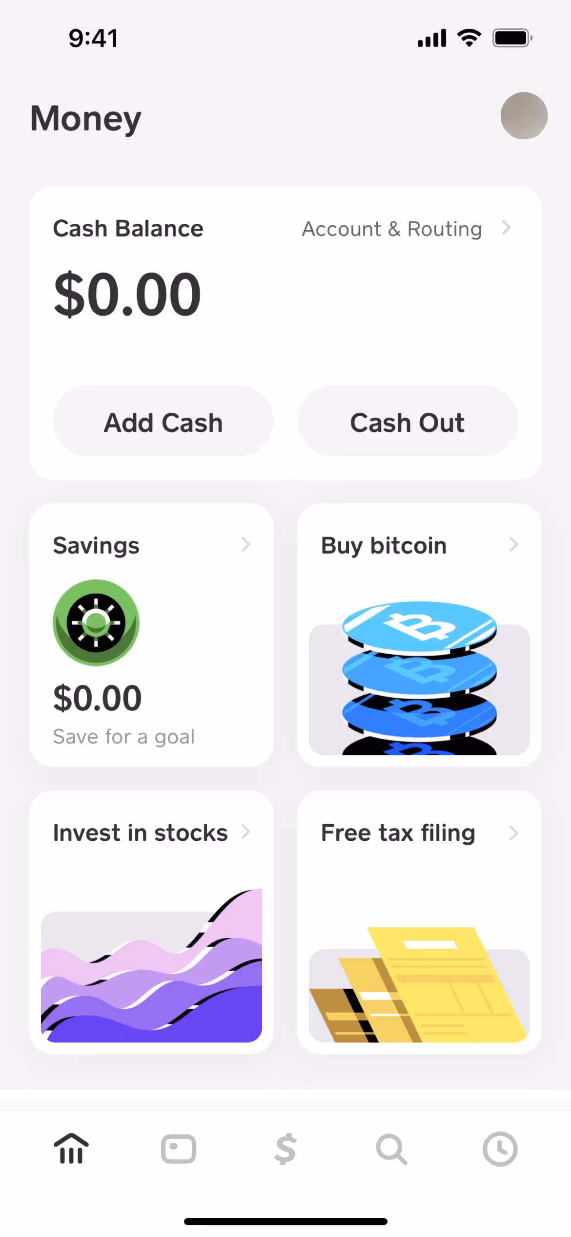
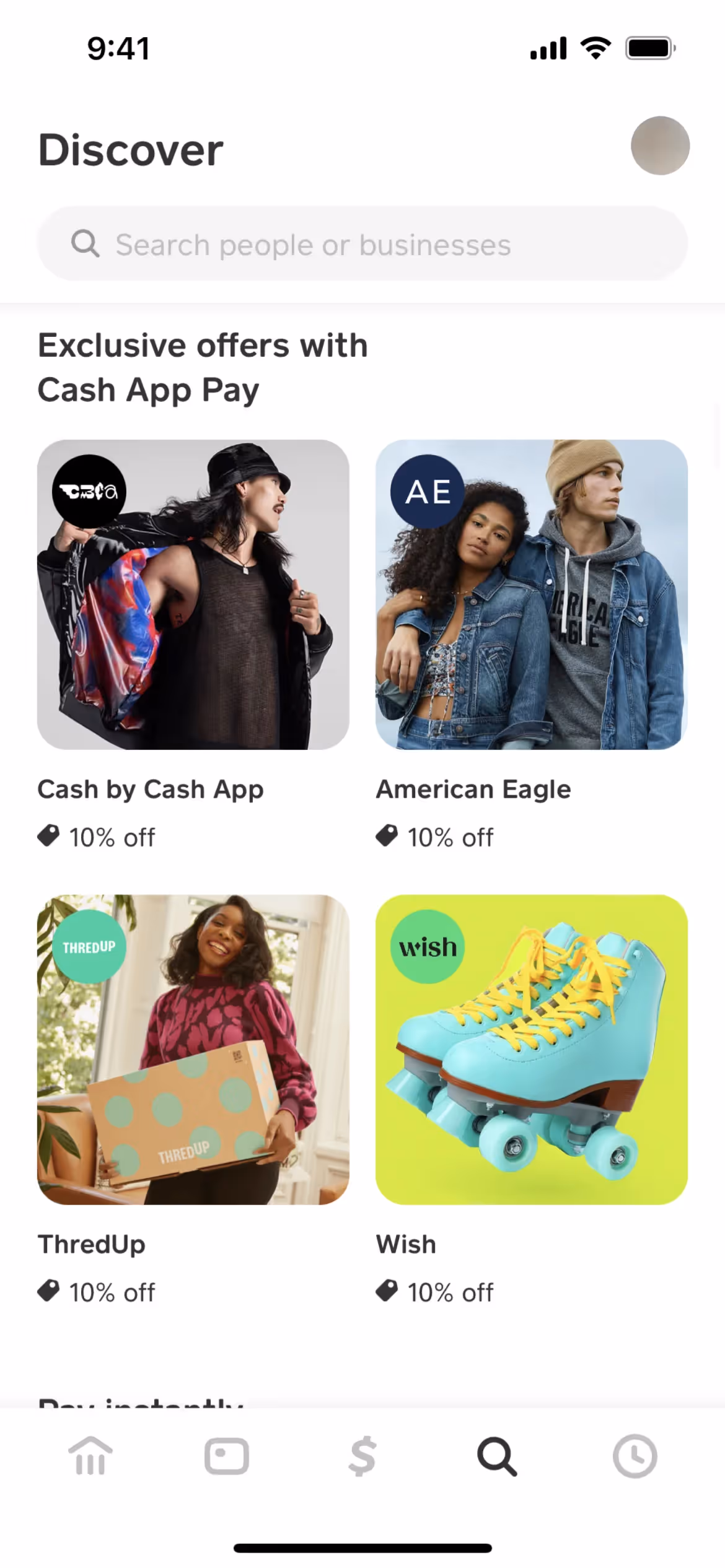
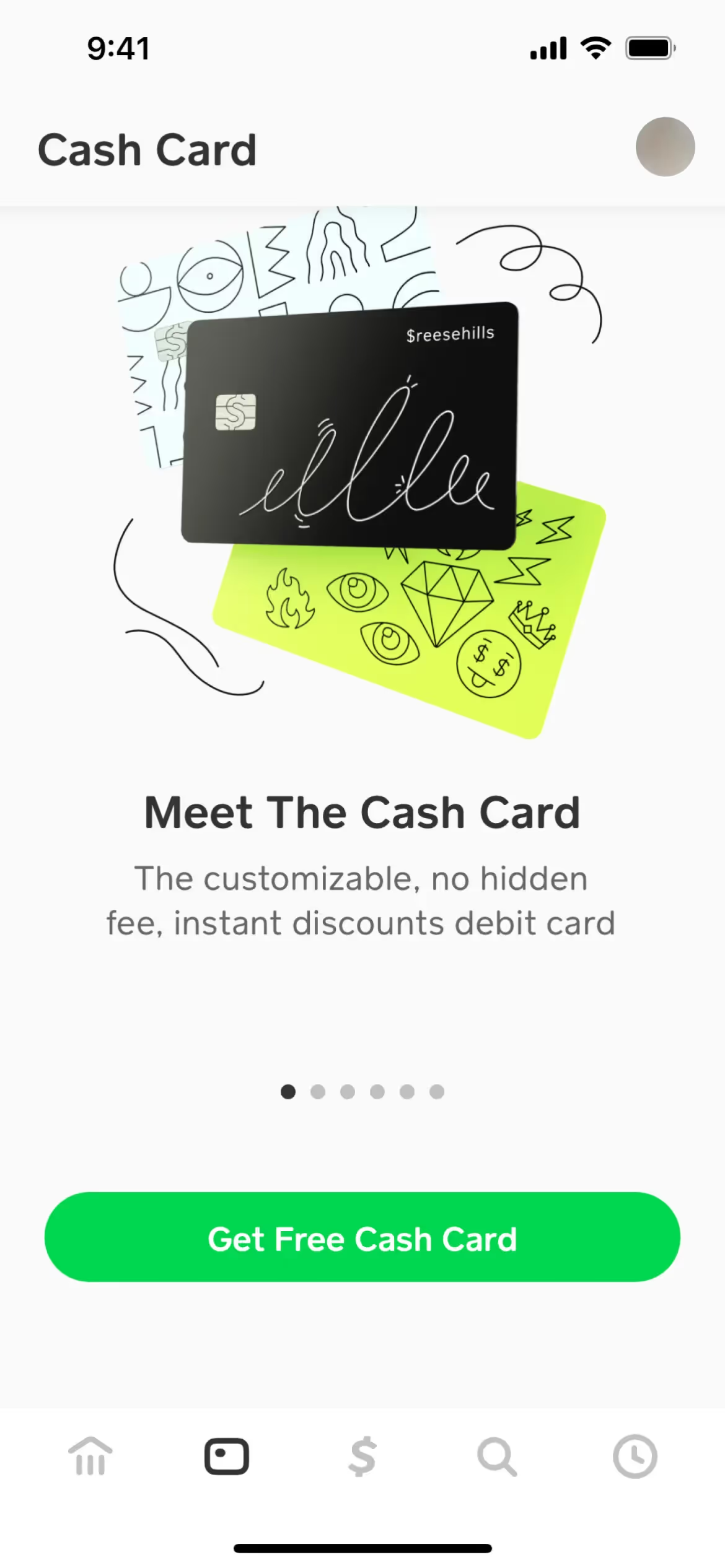
The main colors in Cash App's color palette are White (#FFFFFF), Malachite (#00D54B), and Black (#000000). These colors create a clean, vibrant, and professional look that can inspire your design projects.
The primary color in Cash App's design, white (#FFFFFF), conveys simplicity and clarity, reflecting the app's user-friendly and straightforward approach to financial transactions. Complementing this, the vibrant malachite green (#00D54B) symbolizes growth and prosperity, while black (#000000) adds a touch of sophistication and reliability, enhancing the brand's overall message of trust and innovation.
Cash App's color scheme, while not explicitly detailed in available resources, likely evolved to reflect its modern, user-friendly approach to financial services. The choice of colors appears to be influenced by the need to convey trust, simplicity, and innovation, aligning with the brand's mission to make managing money accessible and straightforward for everyone.
Cash App strategically uses White, Malachite, and Black in its interface designs to guide your actions, influence decisions, and create specific user experiences. White backgrounds enhance readability and focus, Malachite highlights key actions like sending money or investing, and Black provides clarity and authority, ensuring a seamless and trustworthy user journey.
To complement Cash App's primary color (#FFFFFF), consider using shades like navy blue (#000080) for a sophisticated contrast, or light gray (#D3D3D3) to create a balanced, modern look. Additionally, a vibrant coral (#FF7F50) can add a pop of energy and warmth to your design.
On Mobbin’s brand colors page, you can explore a curated list of brand color palettes from top companies. We also offer access to thousands of other UI designs and interfaces from various brands, making it a great resource for finding new color combinations and getting inspiration from real-world examples.
Mobbin helps you stay up-to-date with the latest UI/UX trends by offering an extensive, constantly updated collection of mobile and web design patterns. From color usage to user flows, our platform showcases the latest trends in UI/UX design, allowing you to easily explore current design practices and stay ahead in the industry.
Ready to elevate your design game? Try Mobbin today for free as long as you like, or get full access with any of our paid plans.

Use Mobbin for free as long as you like or get full access with any of our paid plans.


