#1db954
Copy
Copied


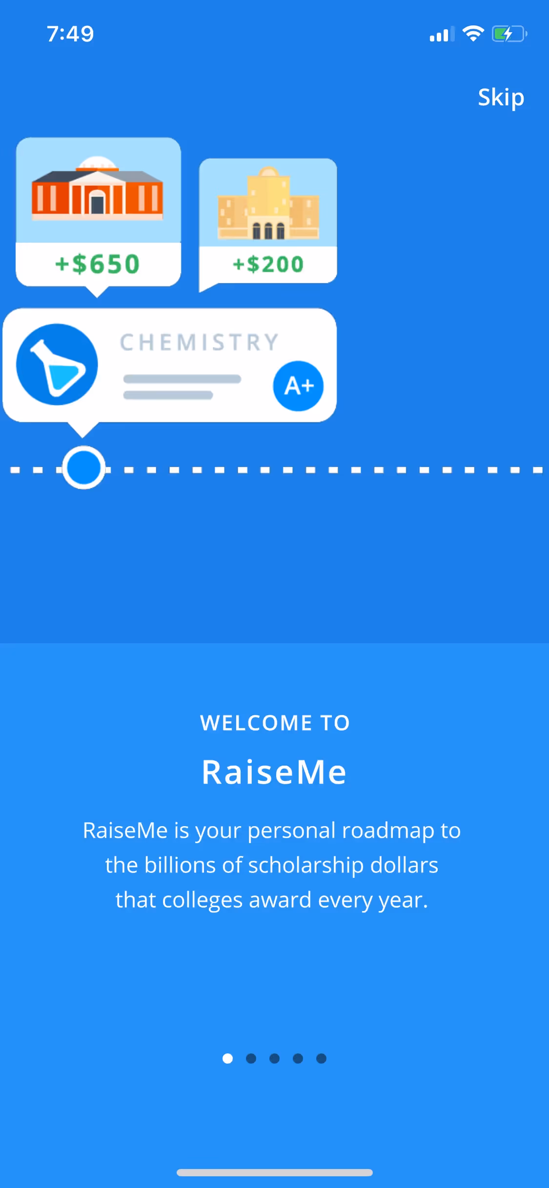
CampusLogic, Inc.'s app, RaiseMe, helps students earn micro-scholarships for their college education. Its branding and interface designs primarily feature Dodger Blue, Black, and a lighter Malibu blue. Here, we've made it easy for you to copy these colors in Hex, CMYK, and RGB formats.
We've identified RaiseMe's main color palette for you: a vibrant Dodger Blue, a classic Black, and a softer Malibu blue.
RaiseMe's primary blue evokes trust and forward momentum, perfectly aligning with their mission to help you fund your future. The supporting black and lighter blue hues create a clean, accessible foundation that makes navigating scholarship opportunities feel both serious and encouraging.
RaiseMe's color scheme is a fantastic lesson in brand alignment, chosen to build trust and optimism for aspiring students. The palette works hard to create an encouraging and accessible environment, directly supporting the company's core mission.
RaiseMe uses its palette to build a foundation of trust and clarity; the dependable Dodger Blue guides you toward key actions, while the sharp contrast of black text ensures their core message of student empowerment is always in focus.
To make RaiseMe's blue pop, we'd explore a vibrant, warm orange for high contrast, or introduce a sunny yellow or soft coral to create a balanced and inviting feel for your designs.
On our brand colors page, you can explore curated color palettes from top companies. We also offer thousands of UI designs from various brands, providing endless inspiration for your next color combination.
Our extensive, constantly updated library of mobile and web design patterns gives you a real-time look at the latest UI/UX trends, from evolving color palettes to innovative user flows. By exploring our collection, you can easily see what leading apps are doing and stay ahead of the curve in the design industry.
Try Mobbin today for free for as long as you like, or get full access with any of our paid plans.

Use Mobbin for free as long as you like or get full access with any of our paid plans.


