#1db954
Copy
Copied

Calm.com, Inc. is the company behind Calm, the leading app for meditation and sleep. Its branding and interface designs primarily use Cloud Burst, White, and Havelock Blue. We've made it easy for you to copy these colors in Hex, CMYK, RGB, and other formats.
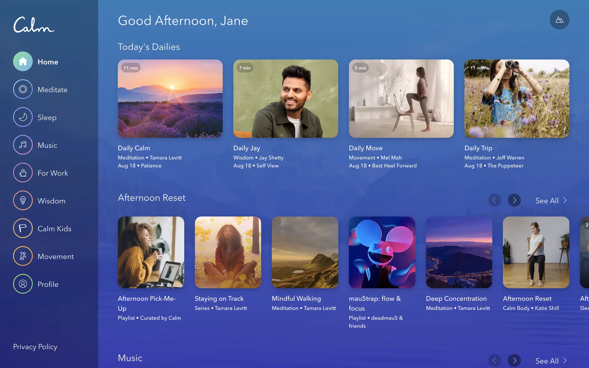
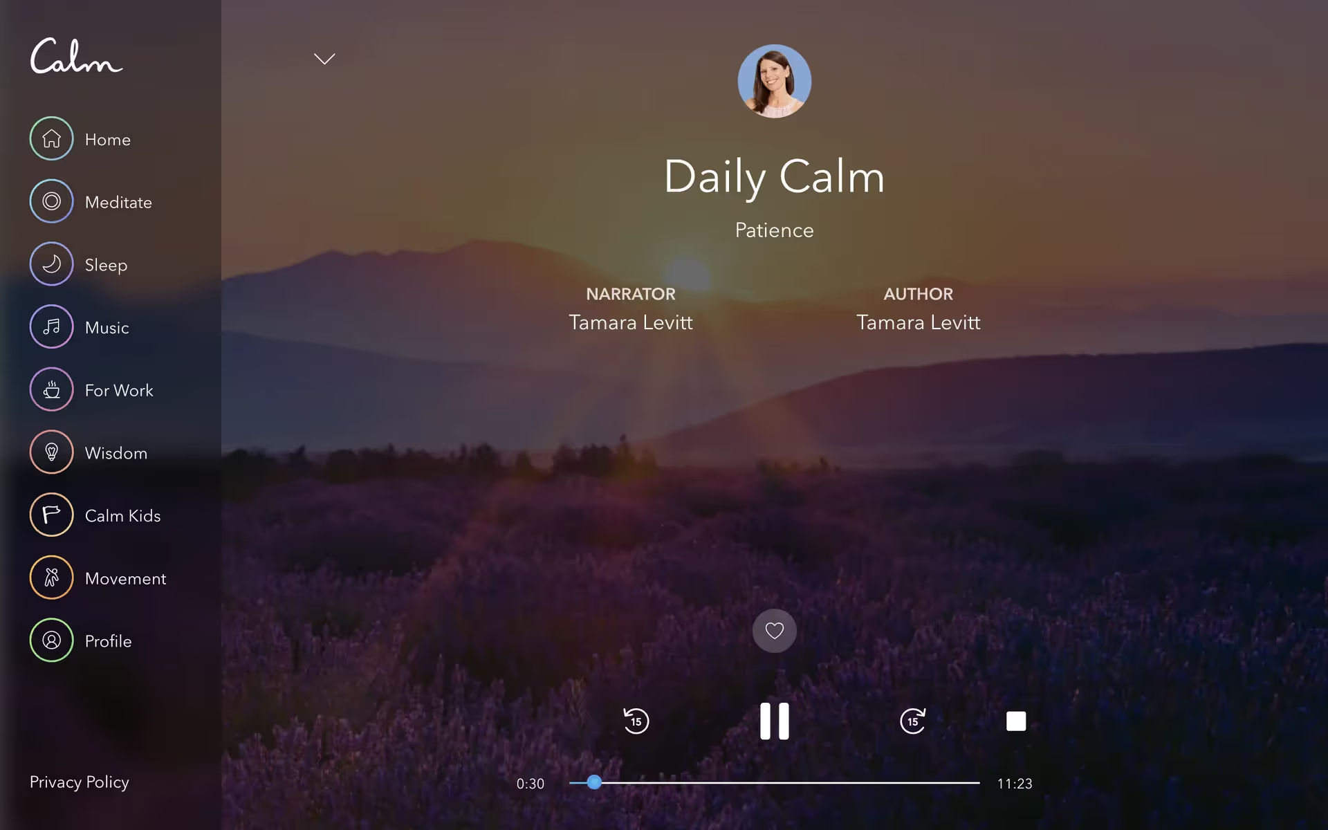
Calm's core color palette revolves around a deep, serene blue known as Cloud Burst (#1B2250), complemented by a lighter Havelock Blue (#6282E3) and crisp White (#FFFFFF). We find this combination is key to creating their signature tranquil and focused user experience.
Calm's primary deep blue (#1B2250) evokes the profound peace of a night sky, instantly setting a tranquil tone for your experience. In our view, the supporting whites and softer Havelock Blue enhance this by adding clarity and a gentle serenity, creating a focused and soothing interface.
While Calm hasn't publicly detailed the specific history, its serene blues and gentle gradients are masterfully chosen to evoke tranquility and peace, directly supporting the app's core mission of improving your sleep and mindfulness.
Our analysis shows Calm uses its deep "Cloud Burst" background to create a serene, focused environment, while strategically using "Havelock Blue" and "White" to guide your attention toward key actions and content for a tranquil, intuitive journey.
To build on Calm's serene foundation, we suggest exploring warm, earthy tones like a soft terracotta to create a grounded contrast, or a muted sage green to further enhance the brand's natural, tranquil atmosphere.
On our brand colors page, you can explore curated color palettes from top companies. We also offer thousands of UI designs from various brands, providing endless inspiration for your next color combination from real-world examples.
Mobbin keeps you at the forefront of design with our extensive, constantly updated library of real-world mobile and web patterns. You can easily explore the latest UI/UX trends as they happen—from evolving color palettes to innovative user flows—and stay ahead of the curve in the industry.
Try Mobbin today for free for as long as you like, or unlock full access with one of our paid plans.


Use Mobbin for free as long as you like or get full access with any of our paid plans.


