#1db954
Copy
Copied


Bumble is a social networking platform that focuses on dating, friendship, and professional networking. Bumble's branding prominently features the colors yellow (#FFC629) and white (#FFFFFF). You can easily copy Bumble's colors in Hex, CMYK, RGB, and other popular formats on this page.
The main colors in Bumble's color palette are a vibrant yellow (#FFC629) and a crisp white (#FFFFFF). These colors are designed to create a warm and inviting user experience.
Bumble's primary color, #FFC629, is a vibrant yellow that conveys warmth, positivity, and energy, aligning perfectly with the app's mission to foster meaningful connections. This bright hue is complemented by white (#FFFFFF), which adds a sense of clarity and simplicity, enhancing the overall user experience by making the interface feel clean and inviting.
Bumble's color scheme, prominently featuring yellow and black, was chosen to create a vibrant and welcoming atmosphere that aligns with its mission of empowering women and fostering genuine connections. The choice of these colors reflects Bumble's commitment to standing out in the social networking space while promoting positivity and inclusivity.
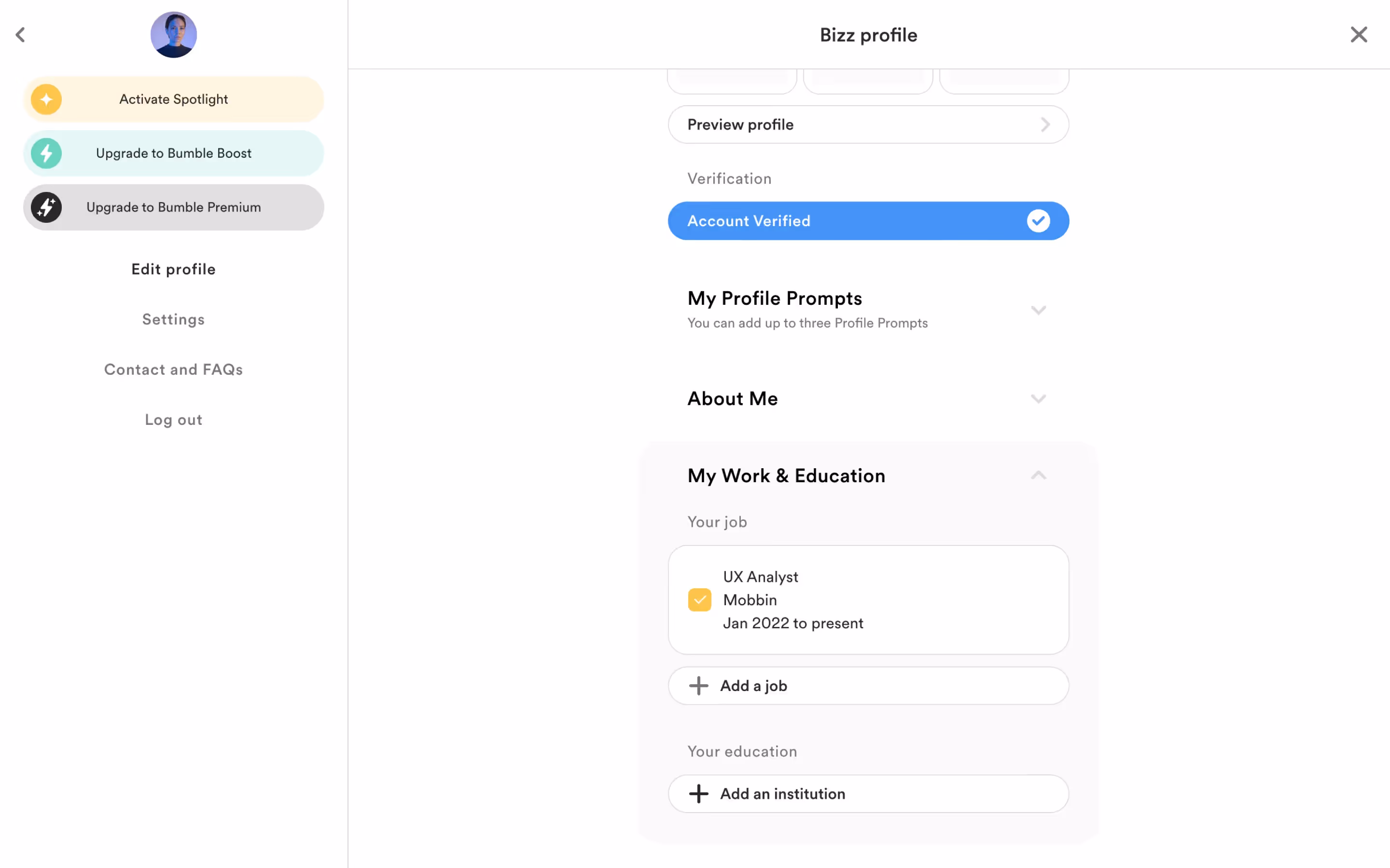
Bumble's strategic use of yellow and white in its interface designs plays a crucial role in guiding user actions and creating specific user experiences. The vibrant yellow (#FFC629) energizes and draws attention, encouraging engagement, while the clean white (#FFFFFF) provides clarity and balance, making navigation intuitive and user-friendly.
To complement Bumble's primary color (#FFC629), consider using shades of teal (#008080) for a striking contrast, or soft lavender (#E6E6FA) for a balanced, harmonious effect. These colors can enhance your design by adding depth and visual interest.
On Mobbin’s brand colors page, you can explore a curated list of brand color palettes from top companies. We also offer access to thousands of other UI designs and interfaces from various brands, making it a great resource for finding new color combinations and getting inspiration from real-world examples.
Mobbin helps you stay up-to-date with the latest UI/UX trends by offering an extensive, constantly updated collection of mobile and web design patterns. From color usage to user flows, you can easily explore current design practices and stay ahead of trends in the industry.
Ready to elevate your design game? Try Mobbin today for free as long as you like, or get full access with any of our paid plans.

Use Mobbin for free as long as you like or get full access with any of our paid plans.


