#1db954
Copy
Copied


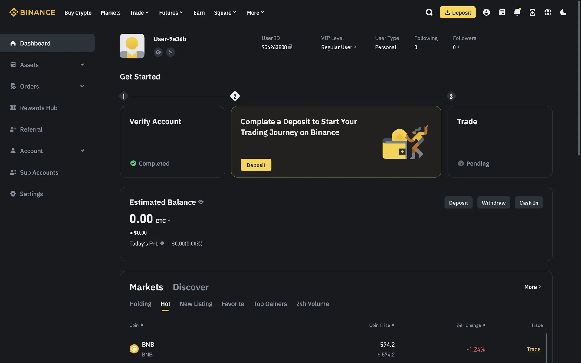
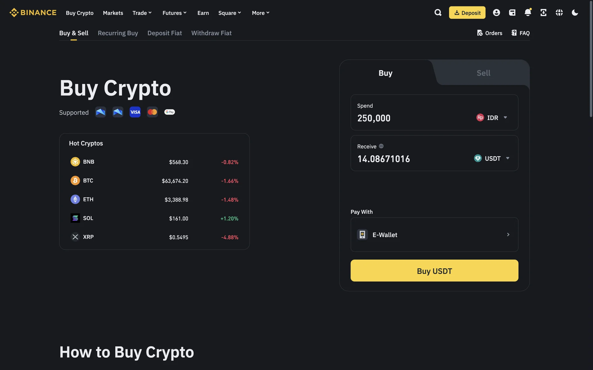
Binance is the world's leading cryptocurrency exchange, serving millions of users globally. Its branding and interface designs prominently feature the colors Shark (#1E2329), White (#FFFFFF), and Bright Sun (#FCD535). You can easily copy Binance's colors in Hex, CMYK, RGB, and other popular formats from this page.
The main colors in Binance's color palette are Shark (#1E2329), White (#FFFFFF), and Bright Sun (#FCD535). These colors create a striking and recognizable visual identity that you can draw inspiration from for your own designs.
In Binance's app or website, the primary color, Shark (#1E2329), conveys a sense of sophistication and reliability, aligning with Binance's brand identity as a secure and professional platform. Complementing this, the use of White (#FFFFFF) provides clarity and simplicity, while Bright Sun (#FCD535) adds a touch of optimism and energy, enhancing the overall user experience by making the interface both engaging and trustworthy.
Binance's color scheme, featuring black and yellow, was chosen to convey a sense of security and innovation. The bold yellow represents energy and optimism, while the black adds a layer of sophistication and trustworthiness, reflecting Binance's commitment to providing a reliable and forward-thinking platform for cryptocurrency trading.
Binance uses color psychology to create a user-friendly and engaging interface. The dark "Shark" background (#1E2329) provides a secure and professional feel, while "White" (#FFFFFF) ensures clarity and readability. The vibrant "Bright Sun" yellow (#FCD535) highlights key actions and notifications, guiding you effortlessly through the platform and encouraging engagement.
To complement Binance's primary color (#1E2329), consider using shades like teal (#008080) for a balanced look, or coral (#FF7F50) for a striking contrast. These colors can enhance your design by adding depth and vibrancy while maintaining a cohesive aesthetic.
On Mobbin’s brand colors page, you can explore a curated list of brand color palettes from top companies. We also offer access to thousands of other UI designs and interfaces from various brands, making it a great resource for finding new color combinations and getting inspiration from real-world examples.
Mobbin helps you stay up-to-date with the latest UI/UX trends by offering an extensive, constantly updated collection of mobile and web design patterns. From color usage to user flows, our platform showcases the latest trends in UI/UX design, allowing you to easily explore current design practices and stay ahead in the industry.
Don't miss out—try Mobbin today for free as long as you like, or get full access with any of our paid plans.


Use Mobbin for free as long as you like or get full access with any of our paid plans.


