#1db954
Copy
Copied


Bear is a beautifully designed Markdown note-taking app for Mac, iPhone, and iPad. Its branding and interface prominently feature the colors red (#D7494C) and white (#FFFFFF). You can easily copy Bear's colors in Hex, CMYK, RGB, and other popular formats on this page.
The main colors in Bear's color palette are a vibrant red (#D7494C) and a crisp white (#FFFFFF). These colors provide a striking contrast that enhances readability and visual appeal.
Bear's primary color, #D7494C, evokes a sense of passion and energy, aligning perfectly with the brand's dynamic and creative identity. This vibrant red not only grabs your attention but also inspires action and enthusiasm. Complementing this, the use of white (#FFFFFF) provides a clean, minimalist backdrop that enhances readability and ensures the red stands out, reinforcing Bear's commitment to clarity and focus.
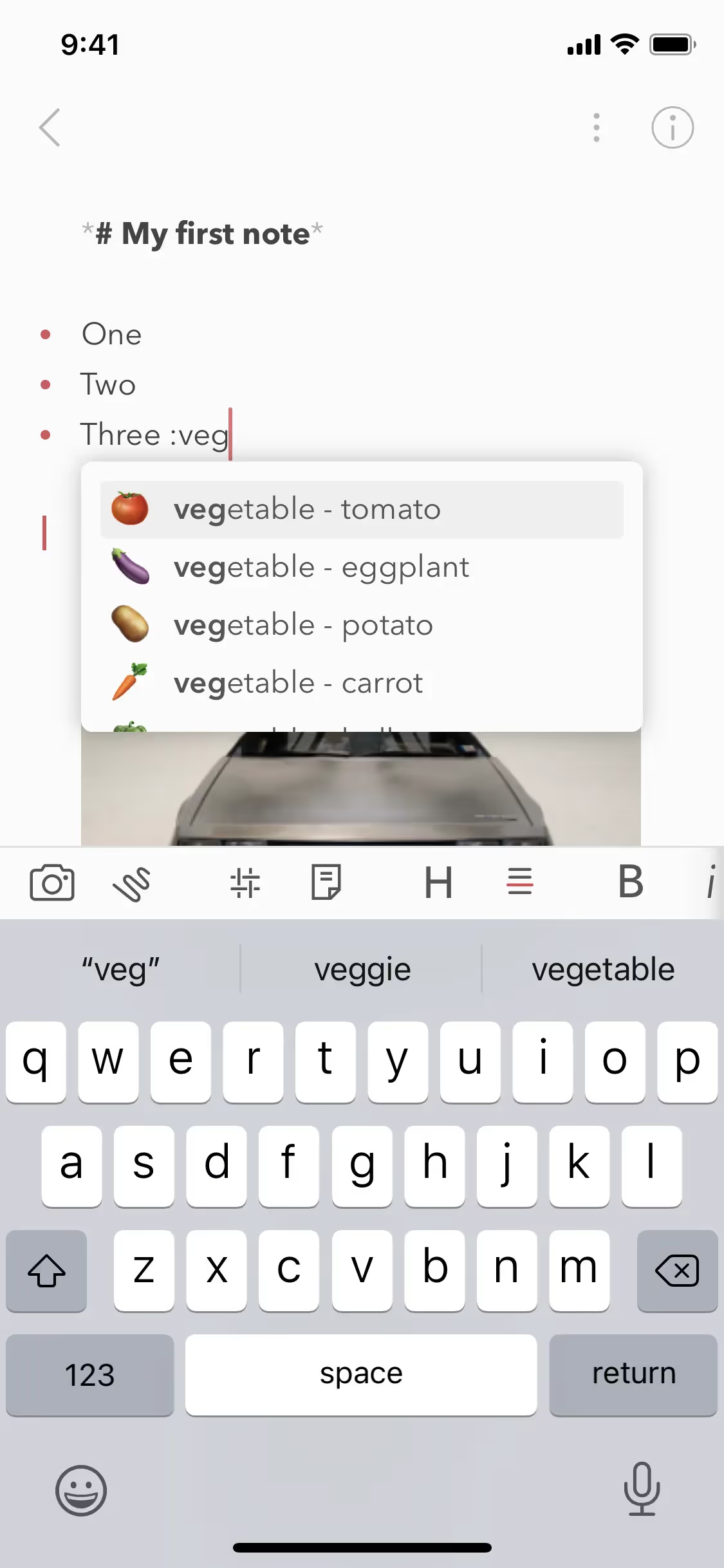
Bear's color scheme is designed to be minimal and polished, creating a cozy space for you to work. While the exact history and influences behind the choice of colors aren't explicitly detailed, the emphasis on elegance and simplicity is clear, aligning with Bear's mission to provide a beautiful and powerfully simple note-taking experience.
Bear uses color psychology in its interface designs to create a cozy and focused workspace. By offering customizable themes and tag icons, Bear leverages colors like red and white to guide your actions, influence your decisions, and enhance your overall user experience. The minimal and polished interface ensures that colors are used judiciously to reduce distractions and support efficient navigation and organization.
To complement Bear's primary color (#D7494C), consider using shades like navy blue (#003366) for a strong contrast, or soft pastels like mint green (#98FF98) and blush pink (#FFC0CB) to create a balanced and harmonious palette. These colors can enhance your design by adding depth and variety while maintaining a cohesive look.
On Mobbin’s brand colors page, you can explore a curated list of brand color palettes from top companies. We also offer access to thousands of other UI designs and interfaces from various brands, making it a great resource for finding new color combinations and getting inspiration from real-world examples.
Mobbin helps you stay up-to-date with the latest UI/UX trends by offering an extensive, constantly updated collection of mobile and web design patterns. From color usage to user flows, you can easily explore current design practices and stay ahead of trends in the industry.
Don't miss out—try Mobbin today for free as long as you like, or get full access with any of our paid plans.


Use Mobbin for free as long as you like or get full access with any of our paid plans.


