#1db954
Copy
Copied


Elevate, Inc. created Balance, a personalized meditation app to improve sleep and reduce stress. Its branding and interface designs feature a calming palette of Prussian Blue, White, and Scooter. On this page, you can easily copy these colors in Hex, CMYK, RGB, and more.
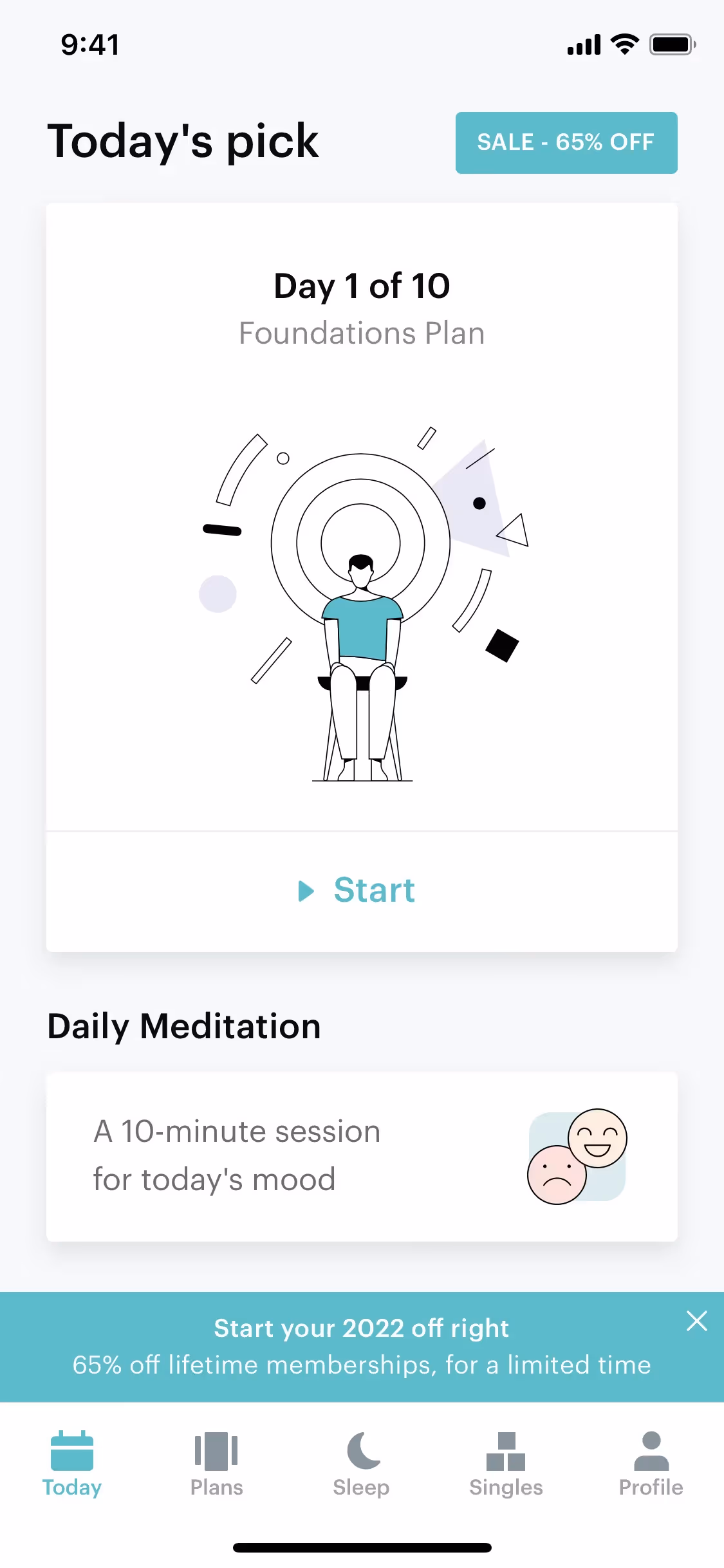
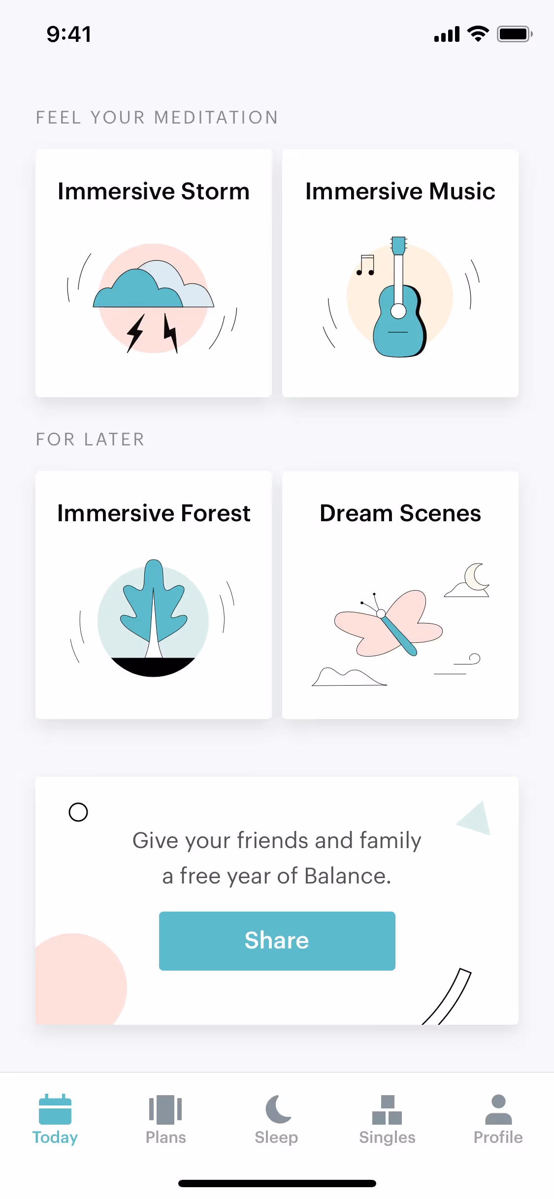
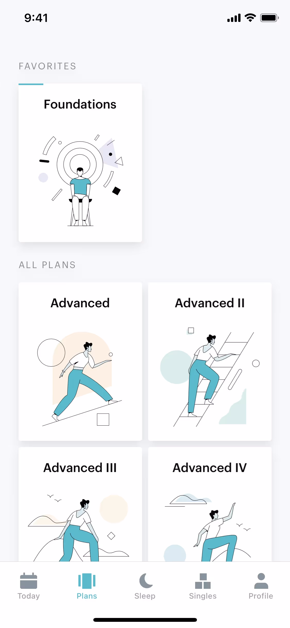
To help you get started, we've identified Balance's primary color palette, which features a sophisticated mix of Prussian Blue (#003748), a crisp White (#FFFFFF), and a vibrant Scooter (#30C5CA).
We find that Balance's deep Prussian Blue establishes a core of trust and stability, while accents of Scooter inject energy and clarity, creating a palette that guides you with confidence.
While the specific history isn't publicly detailed, Balance's color choices are intentionally crafted to create a tranquil and focused atmosphere, perfectly aligning with the app's goal of personalized meditation and stress reduction.
In our analysis, we've observed how Balance masterfully uses its color palette to foster a serene and focused environment. The deep Prussian Blue creates a sense of calm, while the bright Scooter is strategically used for calls-to-action, guiding you seamlessly through your personalized meditation journey.
To create a dynamic contrast with the deep Prussian Blue, we suggest introducing warm, earthy colors like a burnt orange or a soft gold. These can bring a sense of warmth and sophistication, making your UI feel both grounded and premium.
On our brand colors page, you can explore curated color palettes from top companies. We also offer access to thousands of UI designs from various brands, providing endless inspiration for your next color combination.
Our extensive, constantly updated collection of mobile and web design patterns is your window into the latest UI/UX trends, from innovative color usage to entire user flows. By exploring how leading apps are designed, you can easily stay informed on current practices and keep your work ahead of the curve.
Try Mobbin today for free as long as you like, or get full access with any of our paid plans.
Use Mobbin for free as long as you like or get full access with any of our paid plans.


