#1db954
Copy
Copied

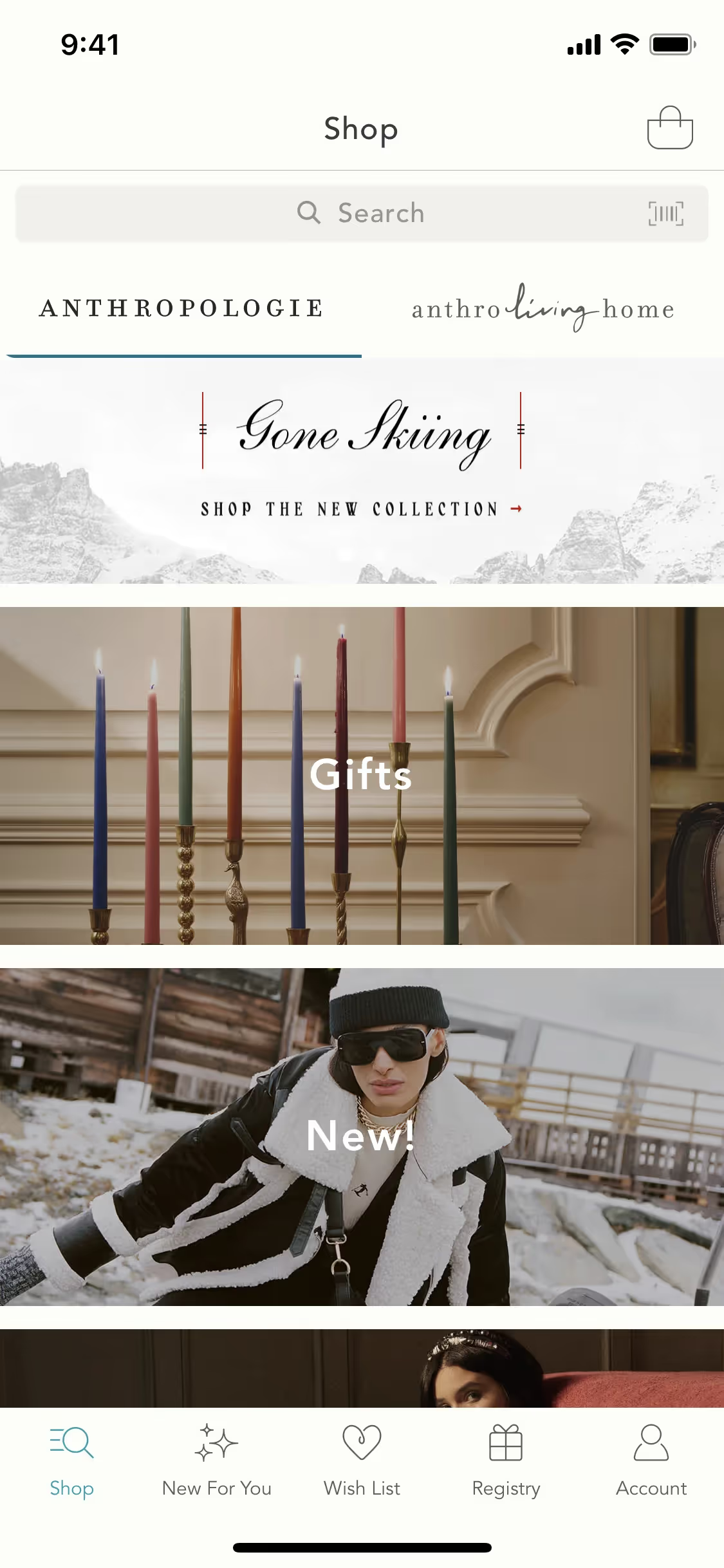
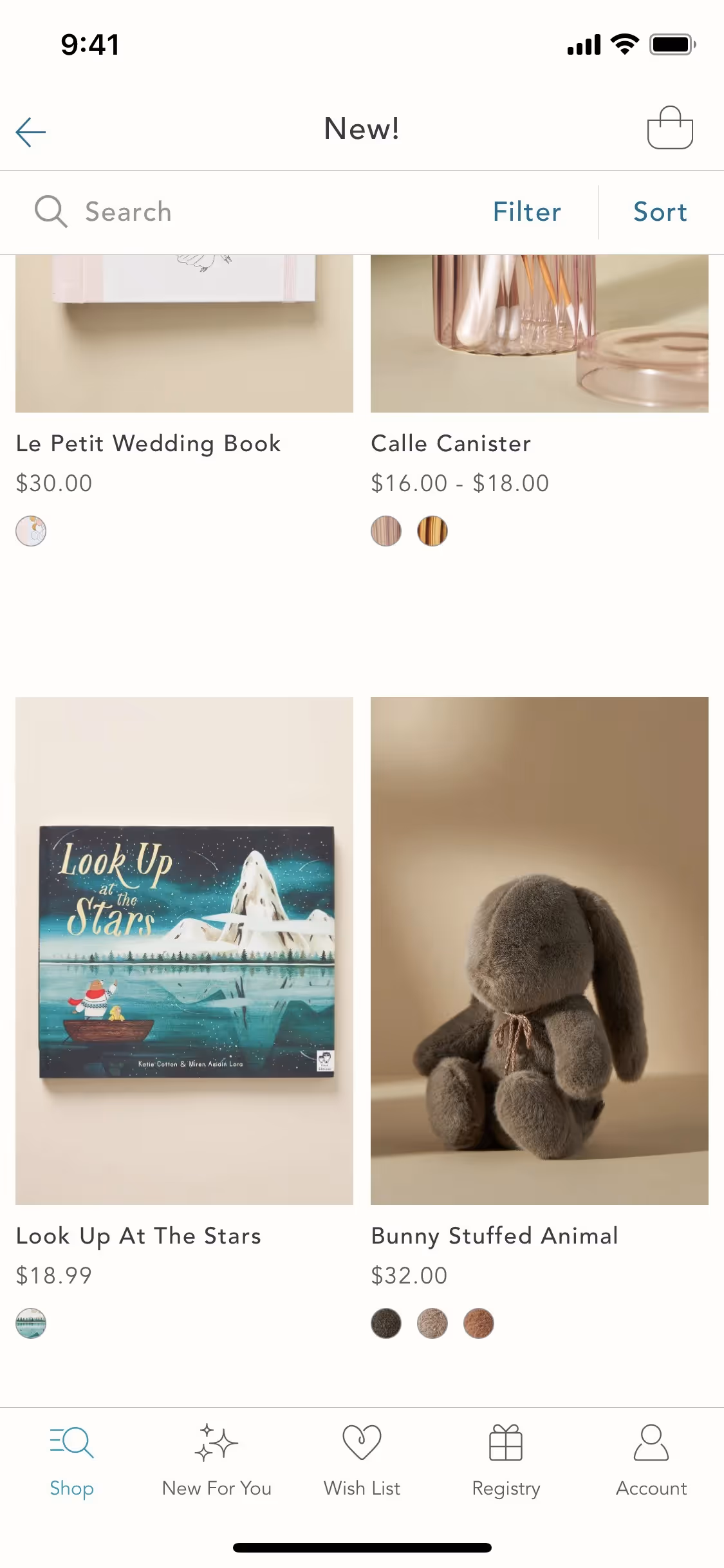
Anthropologie is a retail brand specializing in women's clothing, accessories, and home goods. The brand's general colors include Black (#000000), White (#FFFFFF), and Pear (#E6D73E), which are prominently featured in their branding and interface designs. You can easily copy Anthropologie's colors in Hex, CMYK, RGB, and other popular formats on this page.
The main colors in Anthropologie's color palette are Black (#000000), White (#FFFFFF), and Pear (#E6D73E). These hues offer a versatile and vibrant foundation for your design projects.
In Anthropologie's app or website, the primary color black (#000000) conveys sophistication and elegance, aligning with the brand's chic and modern identity. Complementing this, white (#FFFFFF) adds a sense of purity and simplicity, while pear (#E6D73E) introduces a touch of freshness and vibrancy, enhancing the overall aesthetic and emotional appeal.
Anthropologie's color scheme is a result of a carefully curated selection aimed at reflecting the brand's unique and eclectic style. While specific historical details and key influences behind the choice of colors are not explicitly documented, the vibrant and diverse palette is designed to evoke a sense of creativity and individuality, aligning with the brand's mission to offer distinctive, thoughtfully crafted products for both your closet and home.
Anthropologie's use of color psychology in its interface designs is subtle yet effective. By strategically employing colors like Black, White, and Pear, the brand guides your actions, influences your decisions, and creates specific user experiences. These color choices are thoughtfully integrated to enhance navigation, highlight promotions, and evoke a sense of elegance and warmth, ultimately enriching your interaction with the site.
To complement Anthropologie's primary color (#000000), consider incorporating shades like deep teal (#008080) for a sophisticated contrast, or blush pink (#FFC0CB) to add a soft, inviting touch. These colors can create a balanced and visually appealing palette that enhances your design's overall aesthetic.
On Mobbin’s brand colors page, you can explore a curated list of brand color palettes from top companies. We also offer access to thousands of other UI designs and interfaces from various brands, making it a great resource for finding new color combinations and getting inspiration from real-world examples.
Mobbin helps you stay up-to-date with the latest UI/UX trends by offering an extensive, constantly updated collection of mobile and web design patterns. From color usage to user flows, our platform showcases the latest trends in UI/UX design, allowing you to easily explore current design practices and stay ahead in the industry.
Ready to elevate your design game? Try Mobbin today for free as long as you like, or get full access with any of our paid plans.
Use Mobbin for free as long as you like or get full access with any of our paid plans.


