#1db954
Copy
Copied


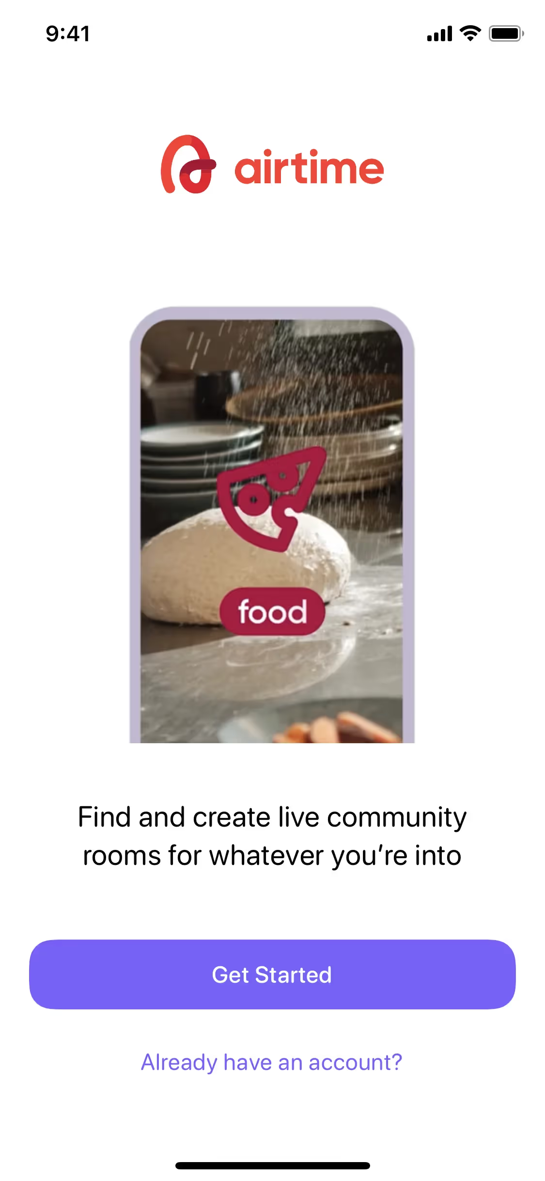
Airtime Media, LLC is the company behind the social video-sharing app, Airtime. Its branding and interface designs feature a palette of Black, Athens Gray, and Cyprus. We've made it easy for you to copy these colors in Hex, CMYK, RGB, and more.
Airtime's color palette is built around a core of Black (#000000), Athens Gray (#F3F5F8), and Cyprus (#013641). We've found this combination offers a clean and professional look for you to draw inspiration from.
In Airtime's design, the dominant black conveys a sense of sophistication and focus, creating a premium feel for your interactions. We find the supporting Athens Gray and Cyprus shades provide a clean, modern backdrop that allows the app's core social experience to take center stage.
While there's no public history on its evolution, Airtime's color palette is a strategic choice that helps foster a fun and dynamic social environment, making the user experience feel more alive.
Airtime masterfully employs its color palette to create a focused and trustworthy experience, using the deep Cyprus to guide your actions with calm confidence while the high-contrast black on a serene Athens Gray canvas keeps the interface clear and intentional.
We suggest pairing the core black with a vibrant accent like electric blue to create high contrast for key actions. Alternatively, introducing earthy tones such as terracotta or a rich emerald green can add warmth and create a more sophisticated balance.
On our brand colors page, you can explore curated color palettes from top companies. We also offer access to thousands of UI designs from various brands, providing endless inspiration for your next color combination.
Our platform offers an extensive, constantly updated library of mobile and web design patterns, giving you a real-time look at the latest trends in UI/UX—from evolving color palettes to innovative user flows. By exploring our collection, you can easily see what leading apps are doing, helping you stay ahead of the curve and keep your designs fresh and relevant.
You can try Mobbin today for free for as long as you like, or get full access with any of our paid plans.
Use Mobbin for free as long as you like or get full access with any of our paid plans.


